# load packages
library(tidyverse)This tutorial introduces you to data visualization in R. We will learn how to develop an understanding of our data before visualization, making quick exploratory visualizations using base R functions, and creating various plots using the ggplot2 package. You’ll learn how to customize and enhance your visualizations for clear data communication. By the end, you’ll have the skills to create plots to effectively present your data insights.
Getting Started
Before you begin, you might want to create a new project in RStudio. This can be done by clicking on the “New Project” button in the upper right corner of the RStudio window. You can then name the project and choose a directory to save it in.
Next, we will load the tidyverse package. This package provides a set of useful functions for data manipulation and visualization. We will use the ggplot2 package to create plots in the later section of this tutorial.
Next, let’s download the two example datasets we will use in this tutorial. These are avialable in the AMMnet Hackathon GitHub repository.
I suggest creating a data folder inside your R project, then we can download the two example datasets so that they are saved to your computer.
# Create a data folder
dir.create("data")

# Download example data
url <- "https://raw.githubusercontent.com/AMMnet/AMMnet-Hackathon/main/01_data-vis/data/"

download.file(paste0(url, "mockdata_cases.csv"), destfile = "data/mockdata_cases.csv")
download.file(paste0(url, "mosq_mock.csv"), destfile = "data/mosq_mock.csv")

# Load example data
malaria_data   <- read_csv("data/mockdata_cases.csv")
mosquito_data  <- read_csv("data/mosq_mock.csv")
The two datasets we will use are mockdata_cases.csv and mosq_mock.csv, which are mock example datasets that should be similar to malaria case surviellance and mosquito field collection data, respectively. In the following sections we will use the mockdata_cases.csv to introduce concepts of data visualization in R. The mosq_mock.csv dataset is used in the challenge sections.
Characterizing our data
Before we start visualizing our data, we need to understand the characteristics of our data. The goal is to get an idea of the data structure and to understand the relationships between variables.
Here are some functions that can help us understand the structure of our data:
# Explore the structure and summary of the datasets
dim(malaria_data)
head(malaria_data)
summary(malaria_data)
We should also explore individual columns/variables
malaria_data$location          # values for a single column
unique(malaria_data$location)  # unique values for a single column
table(malaria_data$location)   # frequencies for a single column
table(malaria_data$location, malaria_data$ages)  # frequencies for multiple columns
Finally, we should check for missing values in each column, as these can affect our visualizations.
sum(is.na(malaria_data))[1] 0
Challenge 1: Explore the structure and summary of the
mosquito_data dataset
- What are the dimensions of the dataset?
- What are the column names?
- What are the column types?
- What are some key variables or relationships that we can explore?
Exploratory Visualizations Using Base R Functions
First, we will look at some exploratory data visualization techniques using base R functions. The purpose of these plots is to help us understand the relationships between variables and characteristics of our data. They are useful for quickly exploring the data and understanding the relationships, but they are not are not great for sharing in scientific publications/presentations.
Single variable comparison
For one variable comparison, we can use hist() function to create a histogram.
hist(malaria_data$prev)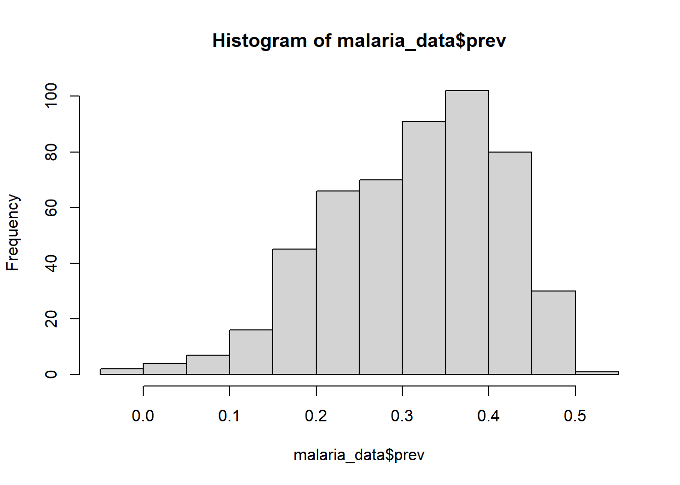
hist(malaria_data$prev,
    breaks = 10,
    main = "Distribution of Malaria Prevalence",
    xlab = "Malaria Prevalence",
    ylab = "Frequency",
    col = "lightblue",
    border = "black")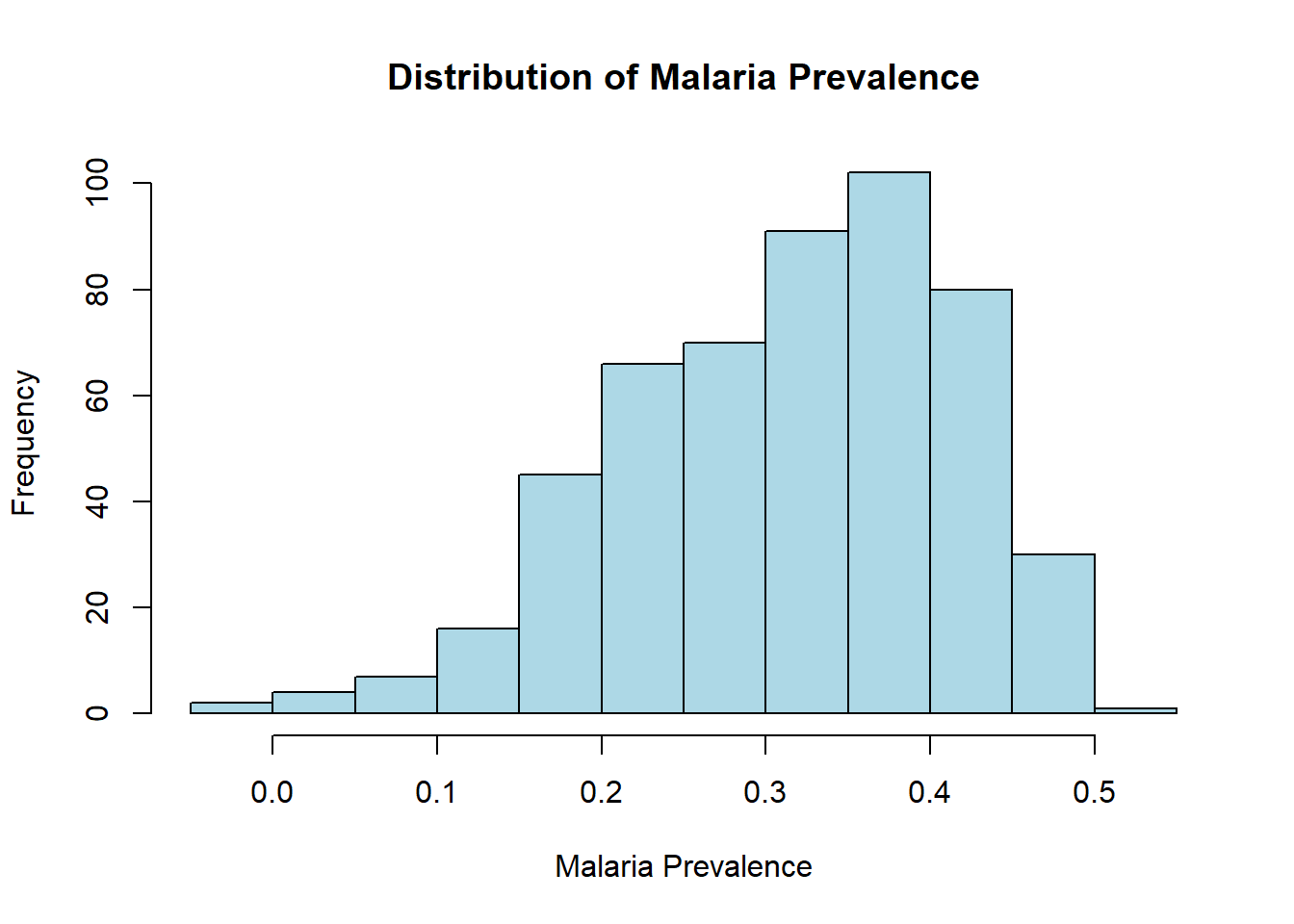
Annother useful function for single variable comparisons is barplot(). In this case, we will use the table() function to count the number of observations in each category, then use barplot() to create a barplot.
barplot(table(malaria_data$ages))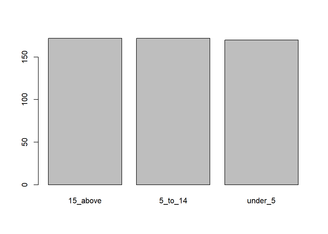
barplot(table(malaria_data$location))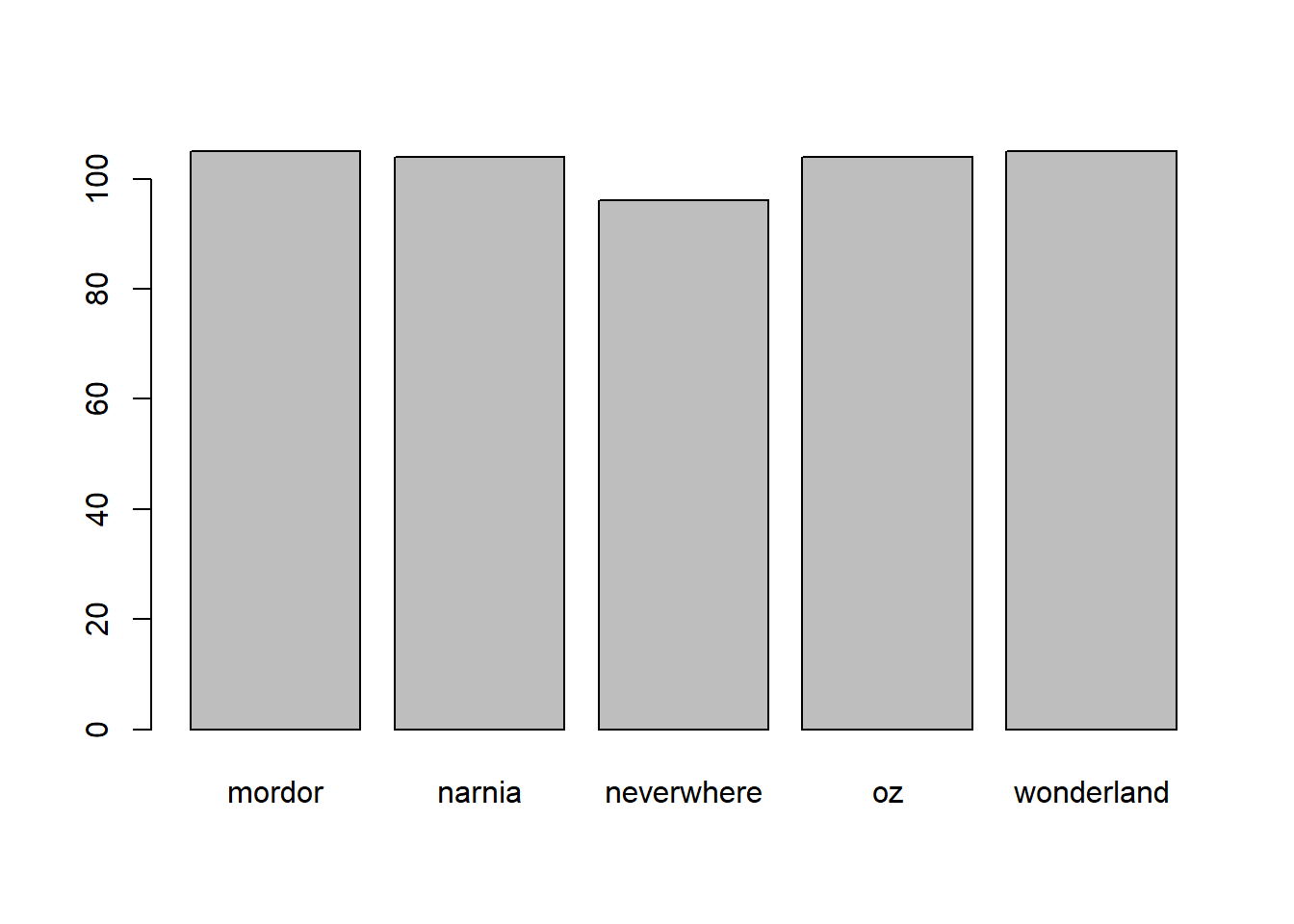
barplot(table(malaria_data$year))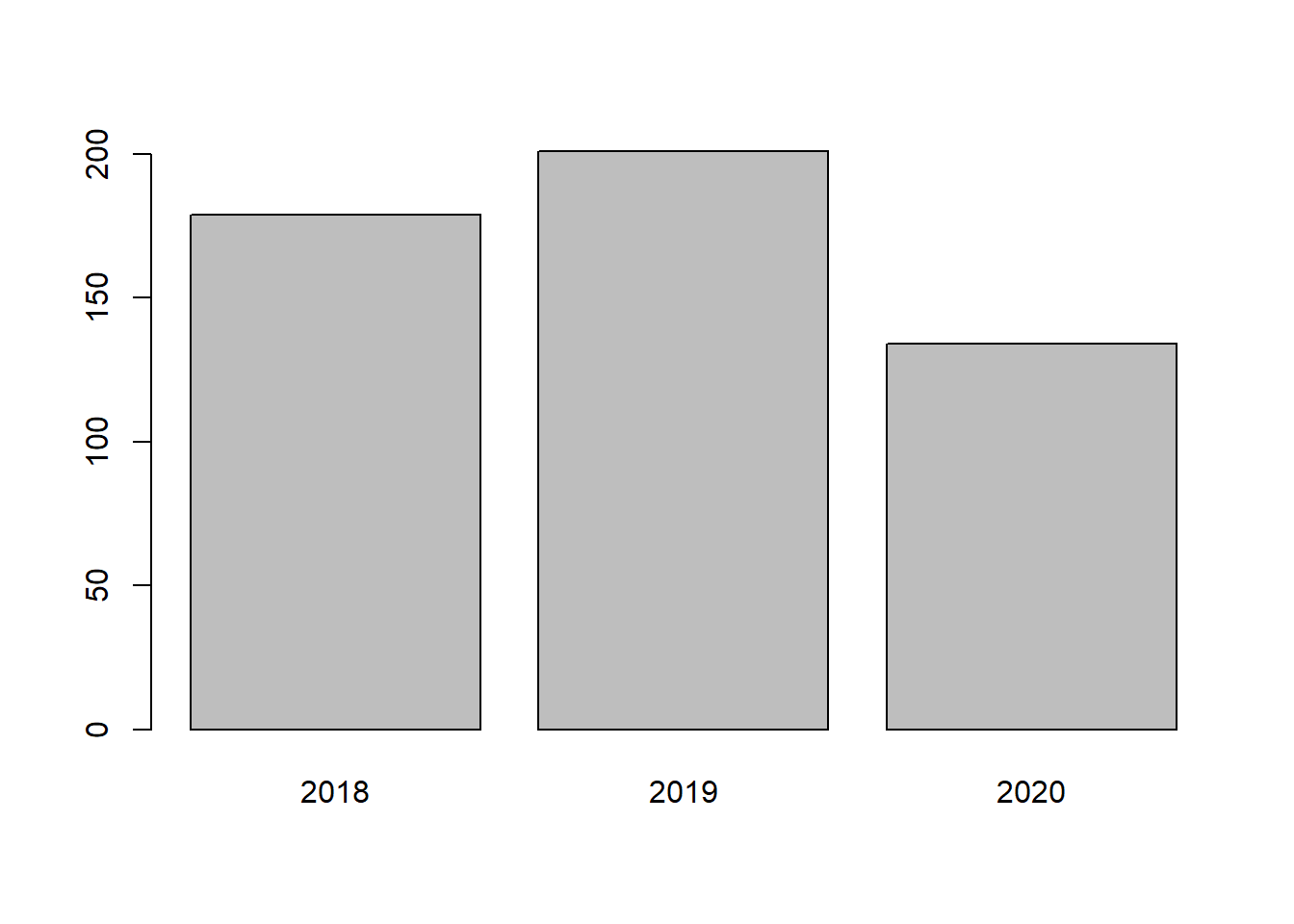
Multiple variables
For multiple variables, we can use plot() function to create a scatterplot. In this case, we will use the S operator to pull out an individual column from the dataset. Then we will use plot() to create a scatterplot. The first argument in plot() is the x variable, and the second argument is the y variable.
plot(malaria_data$total, malaria_data$positive)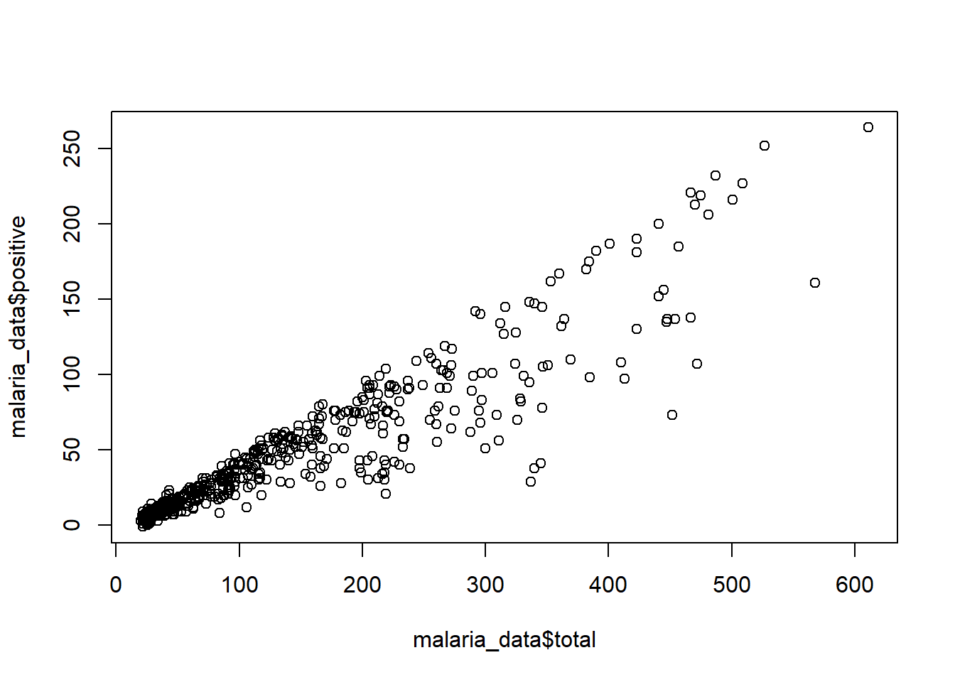
plot(malaria_data$month, malaria_data$prev)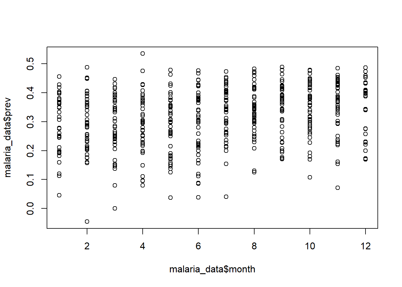
We can also create boxplots by using boxplot() function. In this function we use the ~ operator, which tells R to use the values on the lefthand side of the ~ as the x variable and the righthand side of the ~ as the y variable. I think of ~ as “in terms of”, and for boxplots this means that your numerical variable will be on the x axis and the categorical variable will be on the y axis.
boxplot(malaria_data$prev ~ malaria_data$month) 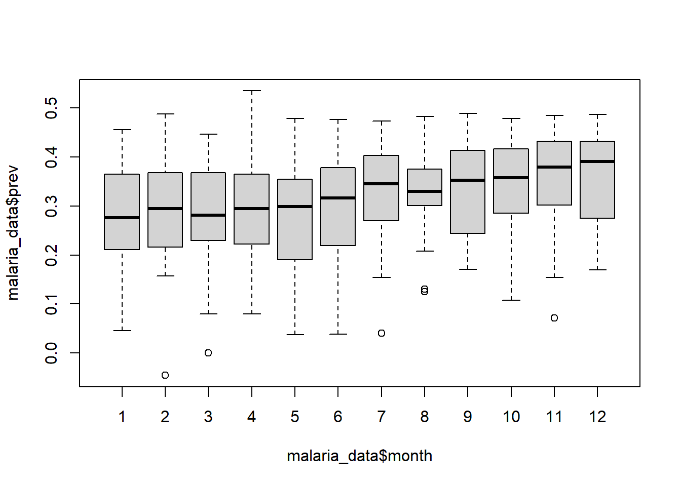
boxplot(malaria_data$prev ~ malaria_data$location) 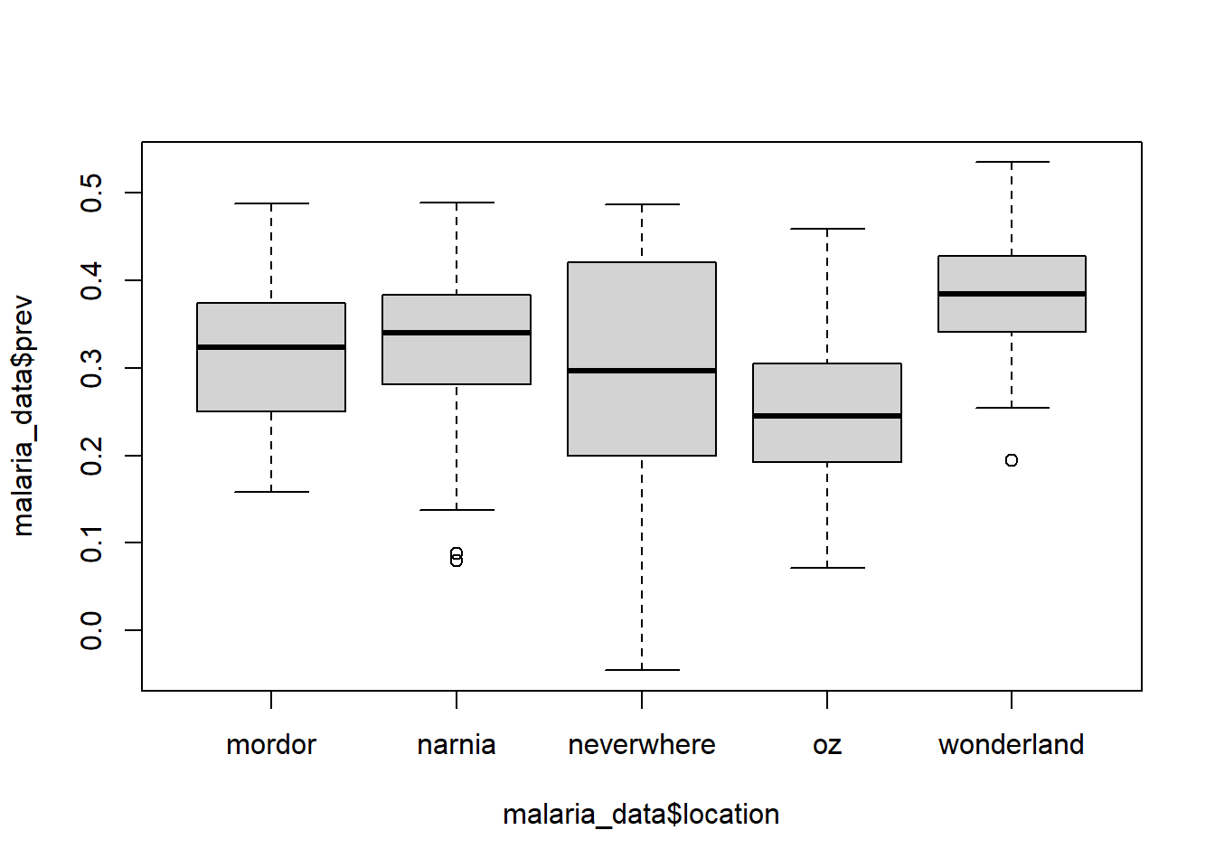
Challenge 2: Explore the structure and summary of the
mosquito_data dataset
- Are their any interesting patterns in individual variables/columns?
- Are there any relationships between variables/columns?
Data Visualization with ggplot2
Base R functions like hist() and barplot() are great for quickly exploring our data, but we may want to use more powerful visualization techniques when preparing outputs for scientific reports, presentations, and publications.
The ggplot2 package is a popular visualization package for R. It provides an easy-to-use interface for creating data visualizations. The ggplot2 package is based on the “grammar of graphics” and is a powerful way to create complex visualizations that are useful for creating scientific and publication-quality figures.
The “grammar of graphics” used in ggplot2 is a set of rules that are used to develop data visualizations using a layering approach. Layers are added using the ‘+’ operator.
Components of a ggplot
There are three main components of a ggplot: 1. The data: the dataset we want to visualize 2. The aesthetics: the visual properties from the data used in the plot 3. The geometries: the visual representations of the data (e.g., points, lines, bars)
The data
All ggplot2 plots require a data frame as input. Just running this line will produce a blank plot because we have stated which elements from the data we want to visualize or how we want to visualize them.
ggplot(data = malaria_data) 
The aesthetics
Next, we need to specify the visual properties of the plot that are determined by the data. The aesthetics are specified using the aes() function. The output should now produce a blank plot but with determined visual properties (e.g., axes labels).
ggplot(data = malaria_data, aes(x = total, y = positive)) 
The geometries
Finally, we need to specify the visual representation of the data. The geometries are specified using the geom_* function. There are many different types of geometries that can be used in ggplot2. We will use geom_point() in this example and we will append it to the previous plot using the + operator. The output should now produce a plot with the specified visual representation of the data.
ggplot(data = malaria_data, aes(x = total, y = positive)) + geom_point()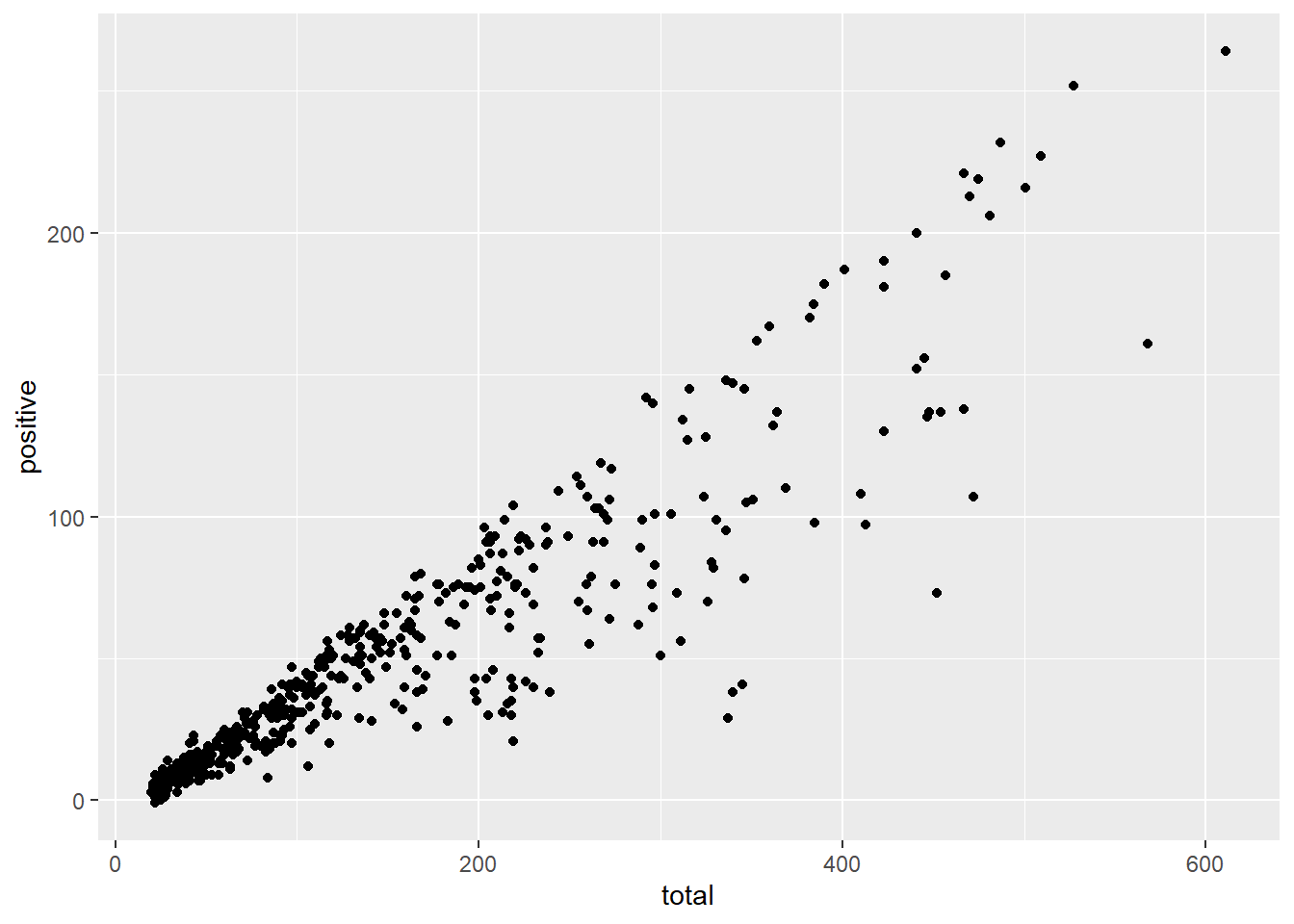
Here are some examples of different geom functions:
ggplot(data = malaria_data, aes(x = prev)) +
  geom_histogram(bins = 20)  # the "bins" argument specifies the number of bars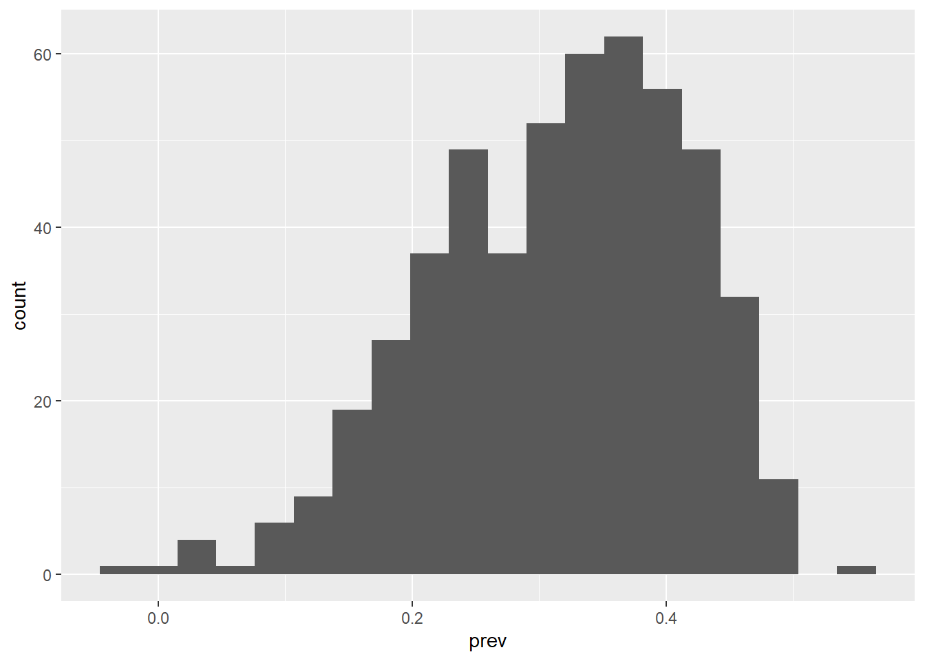
ggplot(data = malaria_data, aes(x = year)) +
  geom_bar(fill = "tomato")  # the "fill" argument specifies the color of the bars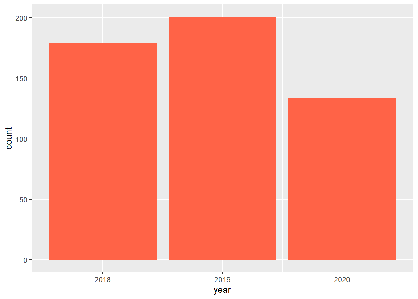
ggplot(data = malaria_data, aes(x = location, y = prev)) +
  geom_boxplot() +
geom_jitter(alpha = 0.2) # geom_jitter adds jittered points to the plot, and 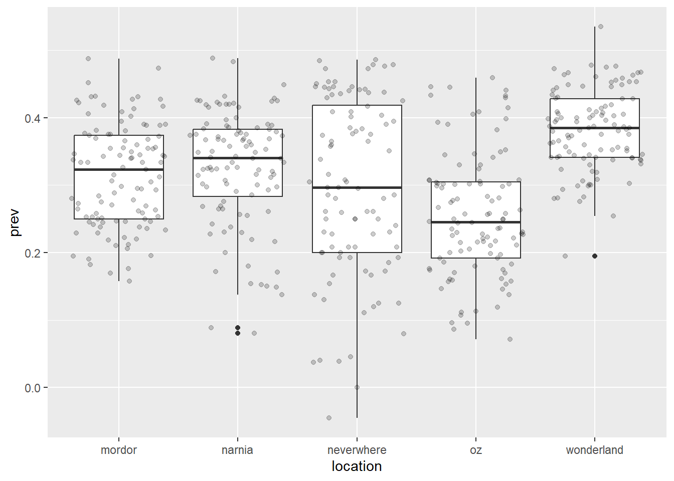
                            # the "alpha" argument specifies the transparency

ggplot(data = malaria_data, aes(x = location, y = prev)) +
  geom_violin() +          # Violin plot are similar to boxplots, but illustrate
  geom_jitter(alpha = 0.2) # the distribution of the data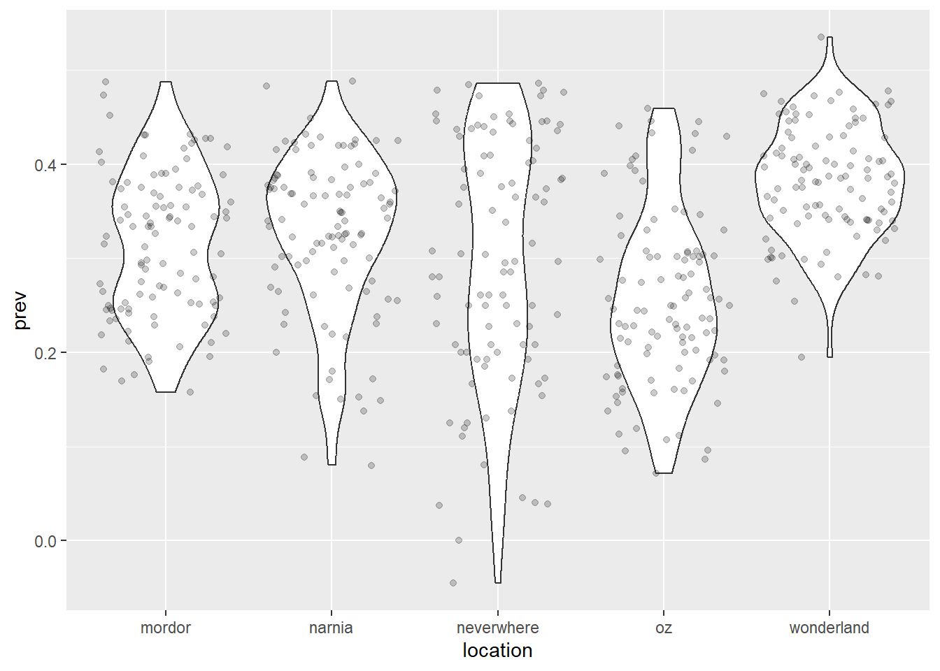
ggplot(data = malaria_data, aes(x = total, y = positive)) +
  geom_point() +
  geom_smooth(method = "lm")  # The smooth geom add a smoothed line to the plot,
`geom_smooth()` using formula = 'y ~ x'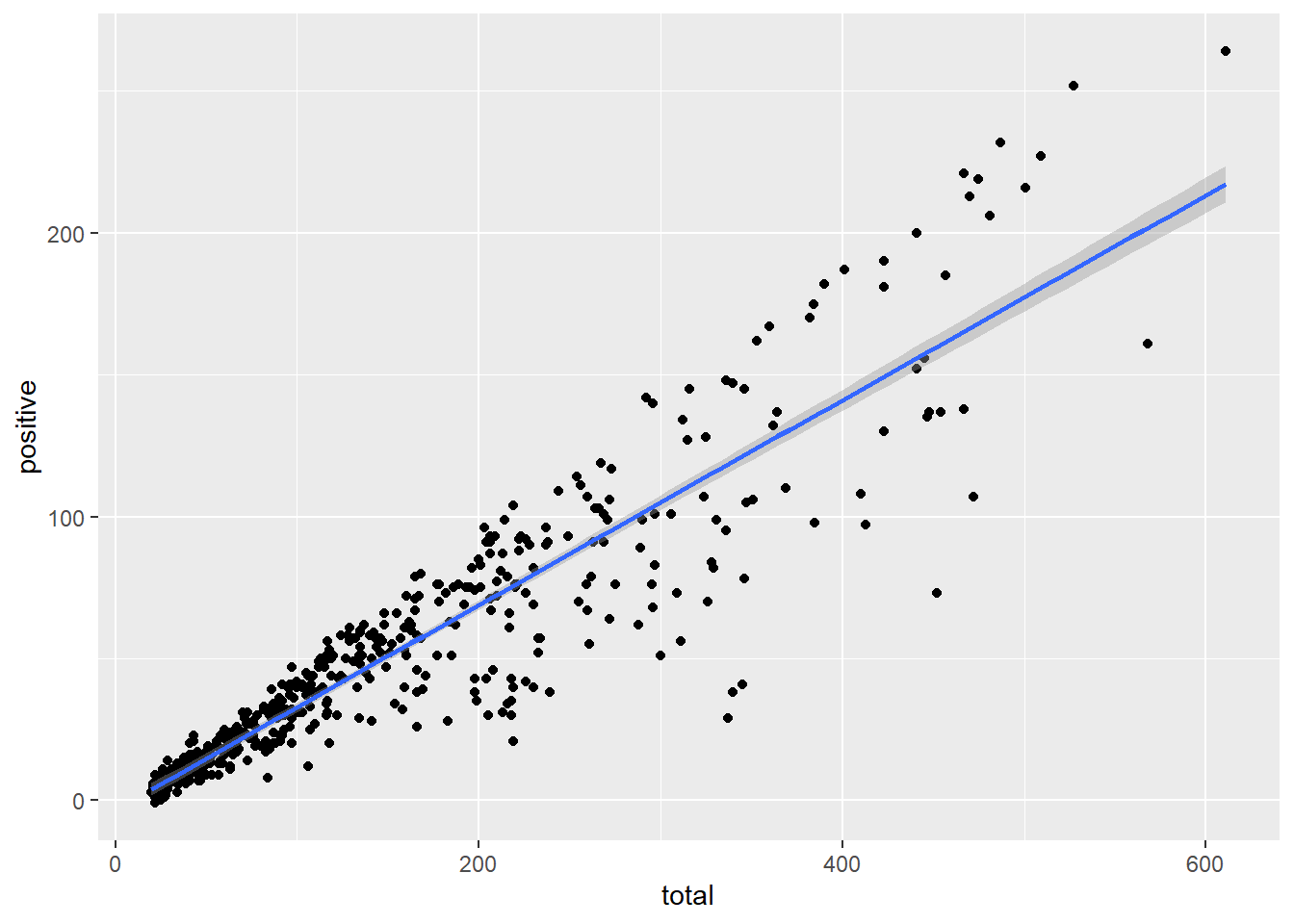
# using the "lm" or other methodsExtending the aesthetics
Additional visual properties, such as color, size, and shape, can be defined from our input data using the aes() function. Here is an example of adding color to a previous plot using the color aesthetic.
ggplot(data = malaria_data, aes(x = total, y = positive, color = location)) +
  geom_point()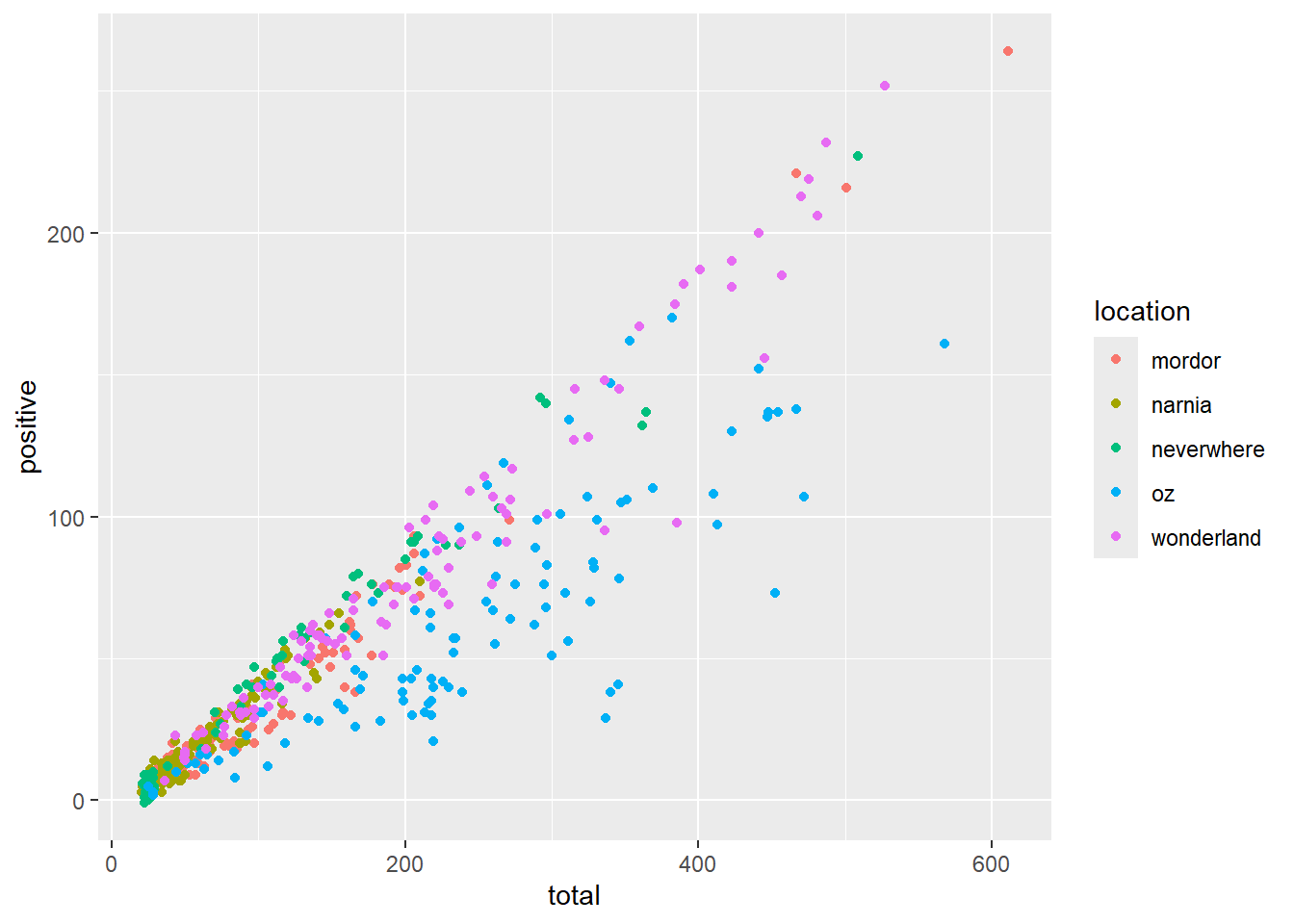
Note that this is different then defining a color directly within the geom_point(), which would only apply a single color to all points.
ggplot(data = malaria_data, aes(x = total, y = positive)) +
  geom_point(color = "tomato")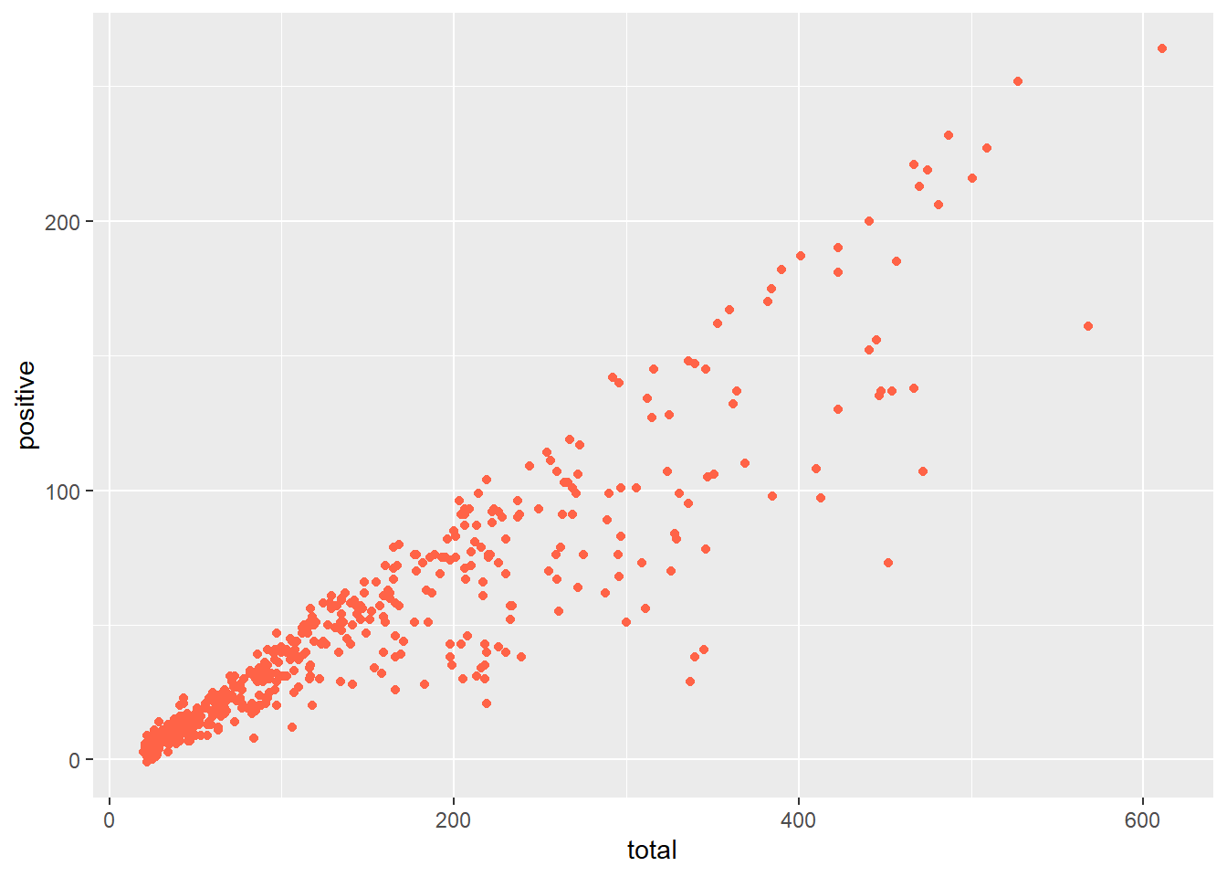
When using the aes() function, the visual properties will be determined by a variable in the dataset. This allows us to visualize relationships between multiple variables at the same time.
ggplot(data = malaria_data, aes(x = prev, fill = ages)) +
  geom_histogram(color = "black")
`stat_bin()` using `bins = 30`. Pick better value with `binwidth`.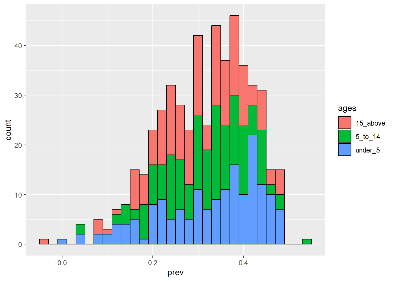
ggplot(data = malaria_data, aes(x = location, y = prev, fill = location)) +
  geom_boxplot() +
  geom_jitter(alpha = 0.2)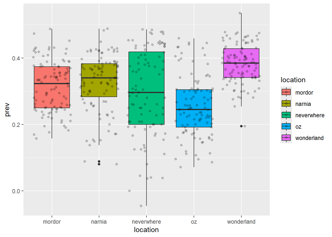
ggplot(data = malaria_data, aes(x = total, y = positive, color = location), alpha = 0.5) +
  geom_point() +
  geom_smooth(method = "lm", se = FALSE)
`geom_smooth()` using formula = 'y ~ x'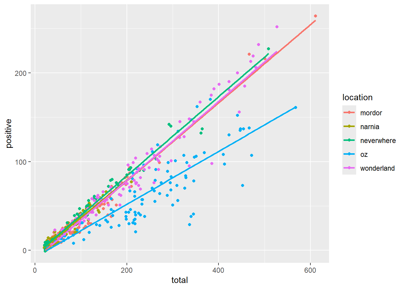
ggplot(data = malaria_data, aes(x = xcoord, y = ycoord, color = location)) +
  geom_point(alpha = 0.5)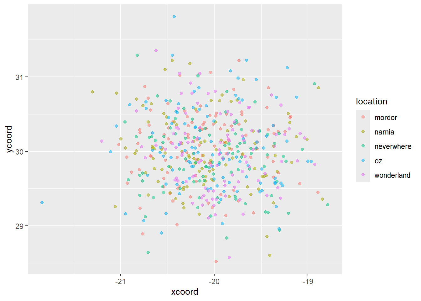
Challenge 3: Create ggplot2 visualizations of the ‘mosquito_data’ dataset
- Are their any interesting patterns in individual variables/columns?
- How can we use the aes() function to view multiple variables in a single plot?
- Are there any additional geometries that may be useful for visualizing this dataset?
Customizing ggplot Graphics for Presentation and Communication
In this section, we will using additional features of ggplot2 to customize and develop high-quality plots that can used in scientific publications and presentations.
Themes
There are many different themes that can be used in ggplot2. The “theme” function is used to specify the theme of the plot. There are many preset theme functions, and further custom themes can be created using the generic theme() function.
Typically you will want to set the theme at the end of your plot.
ggplot(data = malaria_data, aes(x = location, y = prev, fill = location)) +
  geom_boxplot() +
  geom_jitter(alpha = 0.2) +
  theme_classic()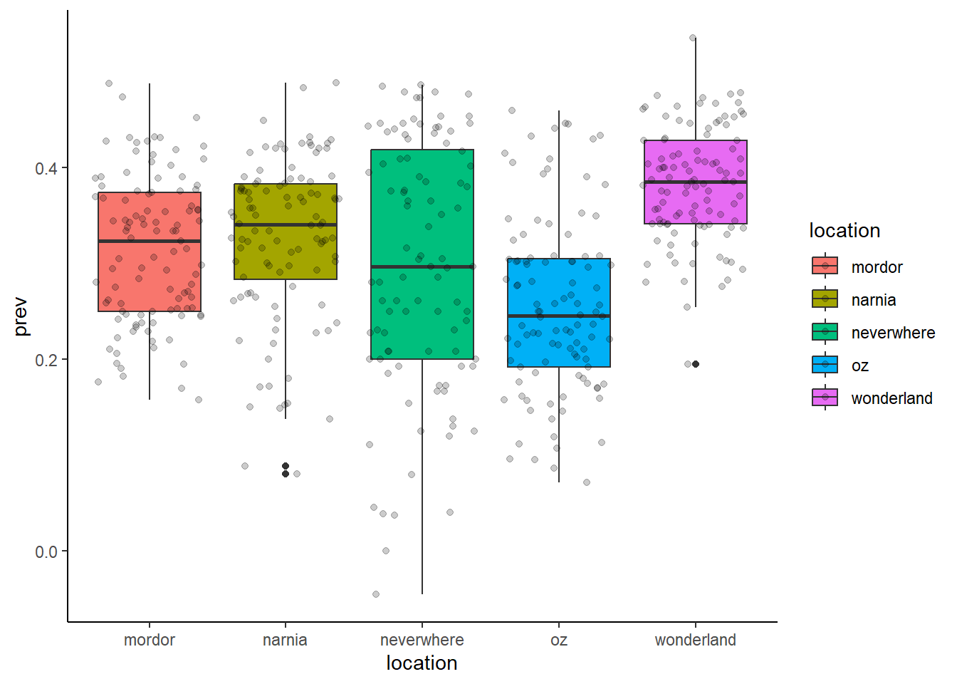
ggplot(data = malaria_data, aes(x = location, y = prev, fill = location)) +
  geom_boxplot() +
  geom_jitter(alpha = 0.2) +
  theme_bw()
ggplot(data = malaria_data, aes(x = location, y = prev, fill = ages)) +
  geom_boxplot() +
  geom_jitter(alpha = 0.2) +
  theme_classic() +
  theme(legend.position = "bottom")
Labels
Labels can be added to various components of a plot using the labs() function.
ggplot(data = malaria_data, aes(x = location, y = prev, fill = ages)) +
  geom_boxplot() +
  geom_jitter(alpha = 0.2) +
  labs(title = "Malaria prevalence by location and age group",
       subtitle = "Data from 2018 - 2020",
       x = "Location",
       y = "Prevalence",
       fill = "Age group") +
  theme_classic() +
  theme(legend.position = "bottom")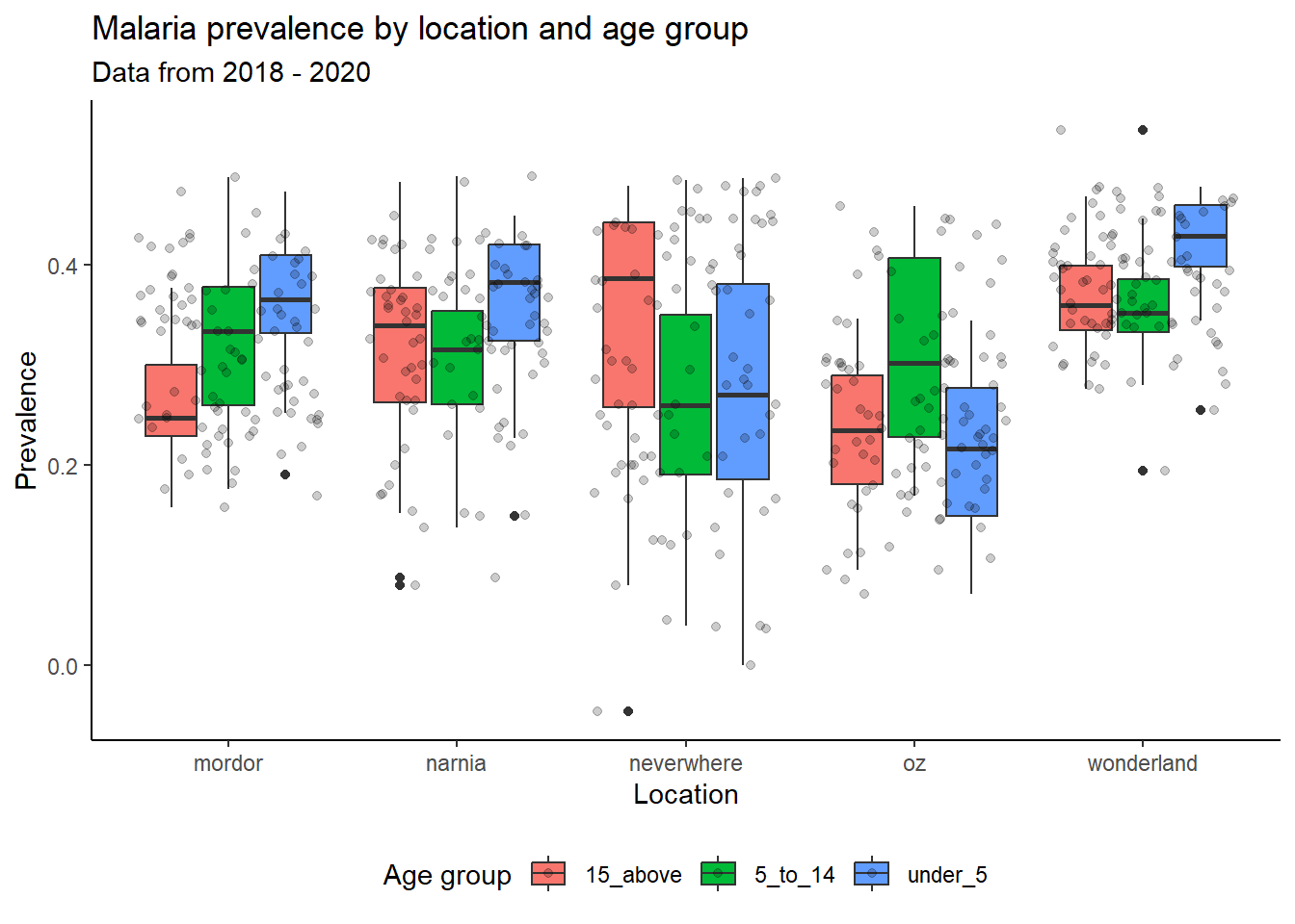
### Custom color palettes
There are many different color palettes that can be used in ggplot2. The “scale_color” function is used to specify the color of the plot. There are many preset color palettes, and further custom color palettes can be created using the generic scale_color() function.
ggplot(data = malaria_data, aes(x = location, y = prev, fill = location)) +
  geom_boxplot() +
  geom_jitter(alpha = 0.2) +
  scale_fill_brewer(palette = "Set1")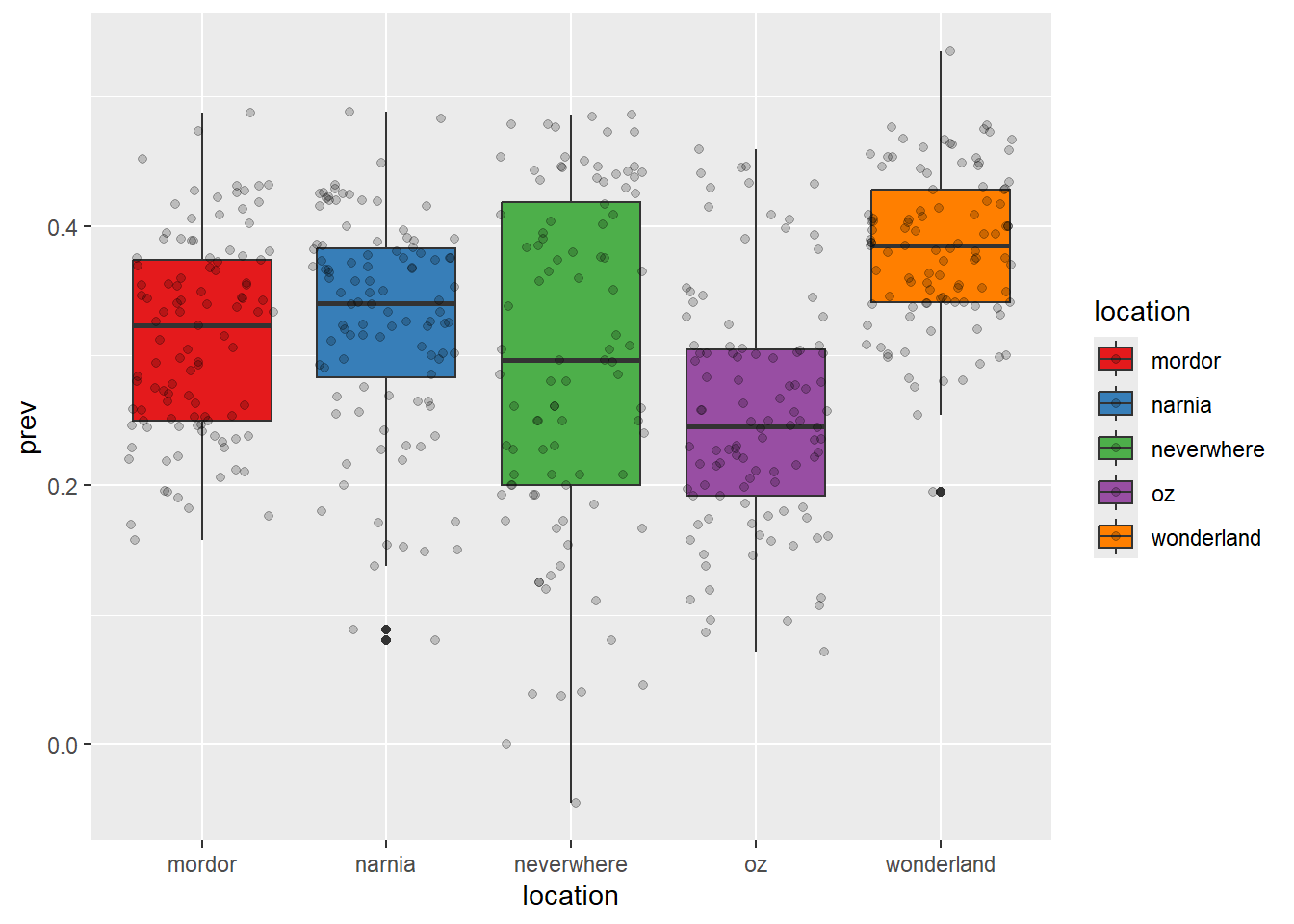
We can also set our own colors.
ggplot(data = malaria_data, aes(x = location, y = prev, fill = location)) +
  geom_boxplot() +
  geom_jitter(alpha = 0.2) +
  scale_fill_manual(values = c("#C6E0FF", "#136F63", "#E0CA3C", "#F34213", "#3E2F5B"))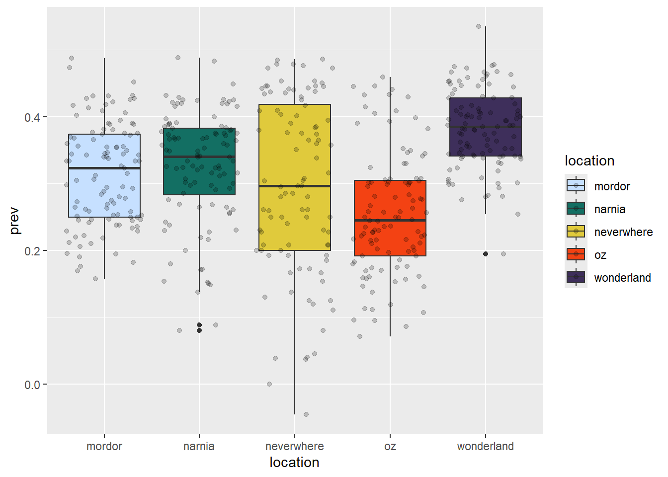
The examples above show how to use colors for categorical variables, but we can also use custom color palettes for continuous variables.
ggplot(data = malaria_data, aes(x = total, y = positive, color = prev)) +
  geom_point() +
  scale_color_gradient(low = "blue", high = "red")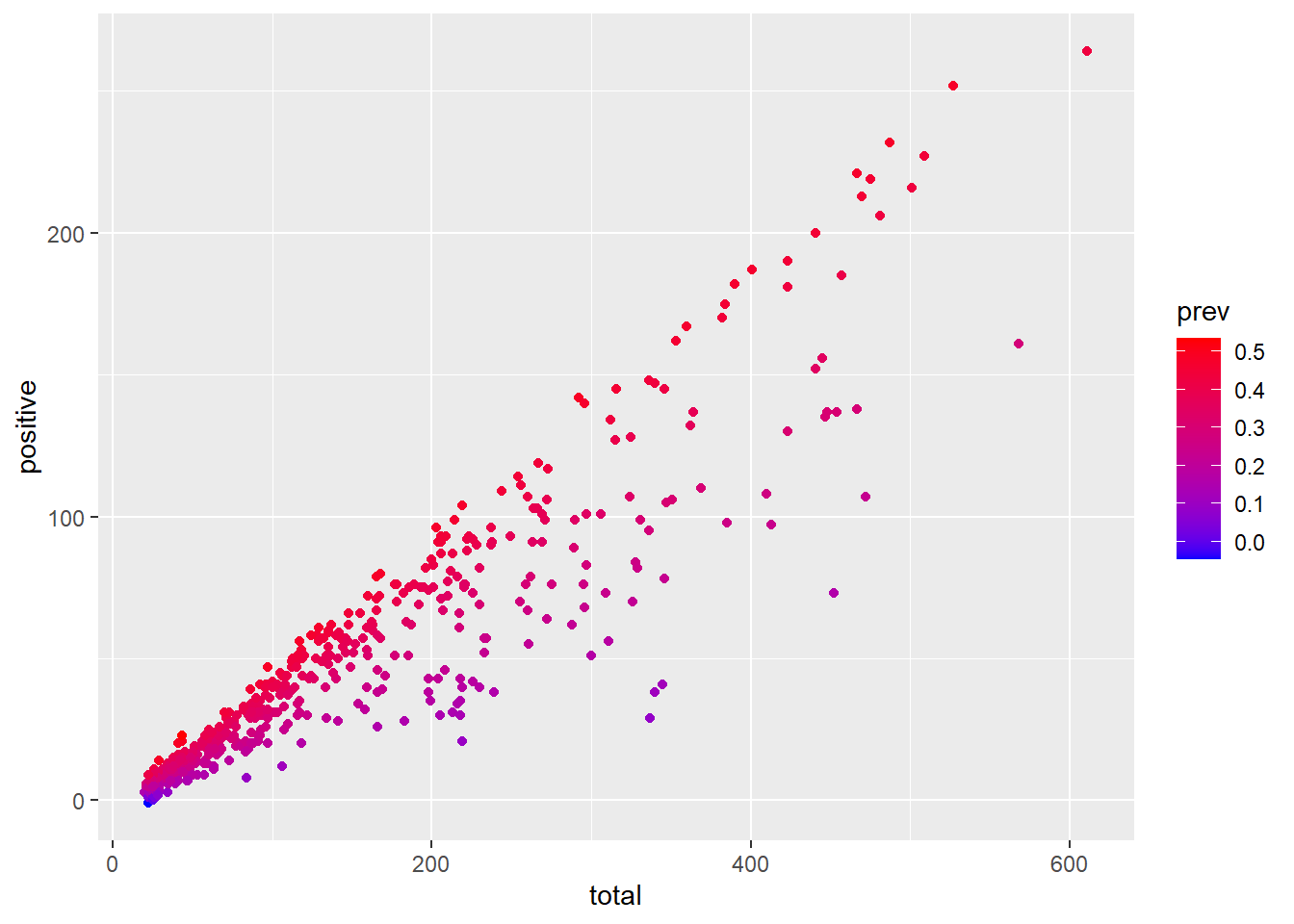
ggplot(data = malaria_data, aes(x = total, y = positive, color = prev)) +
  geom_point() +
  # use viridis package to create custom color palettes
scale_color_viridis_c(option = "magma") 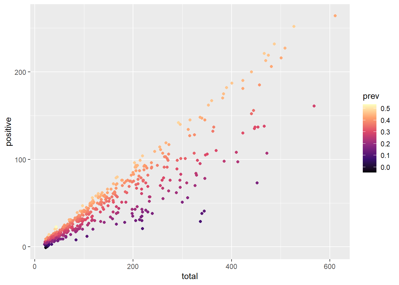
Facets
Facets are a powerful feature of ggplot2 that allow us to create multiple plots based on a single variable. This “small multiple” approach is another effective way to visualize relationships between mutliple variables.
Facets also make use of the ~ operator.
ggplot(data = malaria_data, aes(x = total, y = positive, color = prev)) +
  geom_point() +
  scale_color_viridis_c(option = "magma") +
  facet_wrap(~ location)
ggplot(data = malaria_data, aes(x = location, y = prev, fill = location)) +
  geom_boxplot() +
  geom_jitter(alpha = 0.2) +
  facet_wrap(~ ages) +
  coord_flip() +  # flips the x and y axes
  scale_fill_manual(
    values = c("#C6E0FF", "#136F63", "#E0CA3C", "#F34213", "#3E2F5B")) +
  labs(title = "Malaria prevalence by location and age group",
       subtitle = "Data from 2018 - 2020",
       x = "Location",
       y = "Prevalence",
       fill = "Age group") +
theme_classic()
ggplot(data = malaria_data, aes(x = prev, fill = ages)) +
  geom_histogram(bins = 10) +
  scale_fill_viridis_d() +
  facet_grid(year ~ .)
Exporting plots
We can export plots to a variety of formats using the ggsave() function. We can specify which plot to export by saving in an object and then calling the object in the ggsave() function, otherwise ggsave() will save the current/last plot. The width and height of the output image using the width and height can be set using the width and height arguments, and the resolution of the image using the dpi argument.
The file type can be set using the format argument, or by using a specific file extension. I recommend using informative names for the output file so that it is easily identifiable.
ggplot(data = malaria_data, aes(x = location, y = prev, fill = location)) +
  geom_boxplot() +
  geom_jitter(alpha = 0.2) +
  facet_wrap(~ ages) +
  coord_flip() +  # flips the x and y axes
  scale_fill_manual(values = c("#C6E0FF", "#136F63", "#E0CA3C", "#F34213", "#3E2F5B")) +
  labs(title = "Malaria prevalence by location and age group",
       subtitle = "Data from 2018 - 2020",
       x = "Location",
       y = "Prevalence",
       fill = "Age group") +
theme_classic()

ggsave("malaria-prevalence-age-boxplot.png", width = 10, height = 6, dpi = 300)
Challenge 4: Develop customized ggplot figures for the ‘mosquito_data’ dataset
- Test customs themes on your previous plots, consider looking for new packages with more themes
- Apply custom color palettes to your plots, explore additional color palettes and packages
- Use facets to visualize relationships between multiple variables
Final Challenges
CHALLENGE 1: Create a figure showing how the Anopheles gambiae total counts vary each day and by location.
CHALLENGE 2: Create a figure showing the hourly Anopheles gambiae total counts each hour.