Take the survey!
If you are present for the live session on Thursday March 6th 2025, please click here to take the survey.
Important
Before you begin, we expect participants to have basic knowledge of R. If you’re new to R or would like a refresher, we recommend reviewing the first two live sessions on data visualization and data wrangling beforehand.
Prior experience with GIS data is not required, though it may be helpful. This session will focus primarily on mapping in R, with a brief introduction to key GIS concepts as needed.
Before you start
All of the raw materials, including the R code and data, are available in the Github repository.
We will be using the tidyverse , sf, malariaAtlas, tmap and ggmaps packages in this tutorial. You may need to install them if you do not have them already. To install, run the following command in your R console: install.packages("tidyverse", "sf","malariaAtlas","tmap", "ggspatial", "ggrepel"). Note that the tidyverse package is large and may take a few minutes to install.
You will also need to download the data files used in this tutoral. You can download them here, or use are to add them to your active R project with this code:
url <- "https://raw.githubusercontent.com/AMMnet/AMMnet-Hackathon/main/03_mapping-r/data.zip"
download.file(url, "data.zip")
unzip("data.zip")Code from the live session is available on the Github.
Overview
This live session aims to introduce participants to mapping in R, with a focus on working with vector data. We will start with a brief introduction to key GIS concepts before diving into hands-on mapping techniques using R. Participants will learn how to read, manipulate, and visualize spatial data using the sf, tidyverse, and tmap packages. By the end of the session, attendees will be able to load vector data, perform basic spatial operations, and create effective maps in R.
Objectives of tutorial
Introduction to GIS concepts
- Types of Spatial Data – Overview of vector (point, line, polygon) and raster data.
- Coordinate reference systems
Vector data
- Introduction to
spandsfpackages - Importing shapefiles into R (Spatial points and polygons)
- Joining data to shapefiles
- Making buffes
- Writing shapefiles out in R
- Introduction to
Creating publication quality maps
- Using
ggplot2 - Using
tmap
- Using
Interactive maps using
tmap
GIS concepts
Basic Definitions
Spatial data is a term we use to describe any data which includes information on the locations and shapes of geographic features and the relationships between them, usually stored as coordinates and topology. Spatial data can be used to describe, for example:
- Locations of points of interest (e.g. water bodies, households, health facilities)
- Discrete events and their locations (e.g. malaria cases, crime spots, floods)
- Continuous surfaces (e.g. elevation, temperature, rainfall)
- Areas with counts or rates aggregated from individual-level data (e.g. disease prevalence rates, population census, etc.)
Spatial data can often be categorised into vector data or raster data.
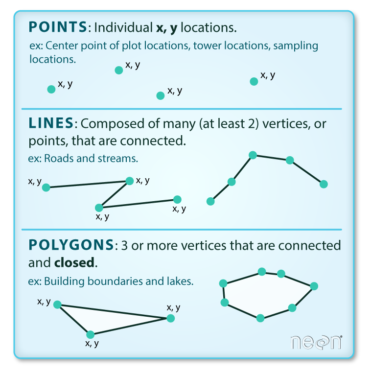
Vector data is a representation of the world using points, lines, and polygons. This data is created by digitizing the base data, and it stores information in x, y coordinates. Vector data is one of two primary types of spatial data in geographic information systems (GIS) – the other being raster data. Example: sea, lake, land parcels, countries and their administrative regions, etc.
source:Colin Williams (NEON); captured from Earth Data Science course
Points: Each individual point is defined by a single x, y coordinate. There can be many points in a vector point file. Examples of point data include: Health facility locations, household clusters.
Lines: Lines are composed of many (at least 2) vertices, or points, that are connected. For instance, a road or a stream may be represented by a line. This line is composed of a series of segments, each “bend” in the road or stream represents a vertex that has defined
x, ylocation.Polygons: A polygon consists of 3 or more vertices that are connected and “closed”. Thus the outlines of plot boundaries, lakes, oceans, and states or countries are often represented by polygons. Occasionally, a polygon can have a hole in the middle of it (like a doughnut), this is something to be aware of but not an issue you will deal with in this tutorial.
TipOccasionally, a polygon can have a hole in the middle of it (like a doughnut), or might gave gaps between each other, this is something to be aware of but not an issue you will deal with in this tutorial. As a tip, we would first recommend reaching out to the owner of the shapefile to clean prior to fixing it yourself.
Raster data consists of a matrix of cells (or pixels) organized into rows and columns (or a grid) where each cell contains a value representing information, such as temperature. Rasters are digital aerial photographs, imagery from satellites, digital pictures, or even scanned maps.
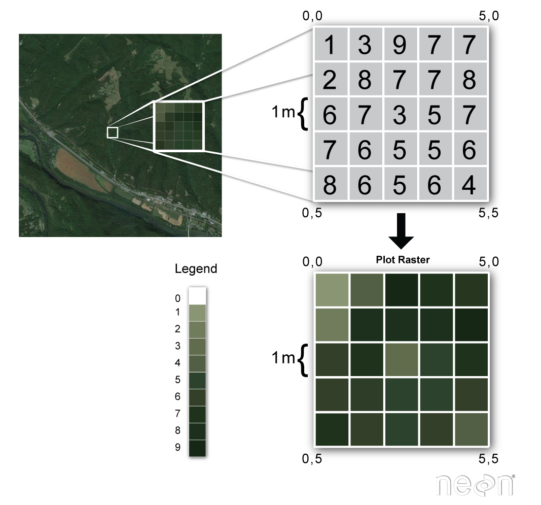
(source: National Ecological Observatory Network (NEON))
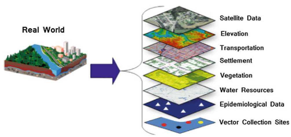
Both types of data structures can either hold discrete or continuous information and can be layered upon each other and interact. An example of discrete data would be data defining the spatial extent of water bodies, built up areas, forests, or locations of health facilities. In contrast, continuous spatial data would be used to record quantities, such as elevation, temperature, population, etc.
source:https://link.springer.com/chapter/10.1007/978-3-030-01680-7_1
Analysis of spatial data supports explanation of certain phenomena and solving problems which are influenced by components which vary in space, or both space and time. Two important properties of geospatial data are, for example, that:
Observations in geographic space tend to be dependent on other geographic factors. For example, variations in disease rates within a country may be due to variations in population density, age, socioeconomic factors, disease vector densities, temperature or a combination of these and other factors.
Observations that are geographically close to each other tend to be more alike than those which are further apart.
Its important to have layers of spatial data all be on the same coordinate reference system.
Coordinate Reference System
source: http://ayresriverblog.com
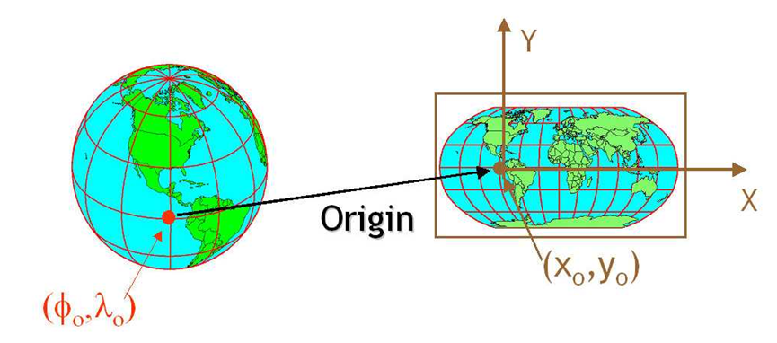
Let’s address the elephant in the room and agree that the Earth is round! ;)
When dealing with spatial data we often are dealing with topology which allows us to describe the information geographically. A coordinate reference system (CRS) refers to the way in which this spatial data that represent the earth’s surface (which is round / 3 dimensional) are flattened so that you can “Draw” them on a 2-dimensional surface (e.g. your computer screens or a piece of paper). There are many ways which we can ‘flatten’ the earth, each using a different (sometimes) mathematical approach to performing the flattening resulting in different coordinate system grids: most commonly the Geographic Coordinate System (GCS) and Projected Coordinate System (PCS). These approaches to flattening the data are specifically designed to optimize the accuracy of the data in terms of length and area and normally are stored in the CRS part of the shapefile in R. This is especially important when dealing with countries that are further away from the equator. Here is a fun little video to showcase how coordinate reference systems can really change/distort the reality of the actual geography!
Geographic Coordinate System
A geographic coordinate system is a reference system used to pin point locations onto the surface of the Earth. The locations in this system are defined by two values: latitude and longitude. These values are measured as angular distance from two planes which cross the center of the Earth - the plane defined by the Equator (for measuring the latitude coordinate), and the plane defined by the Prime Meridian (for measuring the longitude coordinate).
A Geographic Coordinate System (GCS) is defined by an ellipsoid, geoid and datum.
The use of the ellipsoid in GCS comes from the fact that the Earth is not a perfect sphere. In particular, the Earth’s equatorial axis is around 21 km longer than the prime meridian axis. The geoid represents the heterogeneity of the Earth’s surface resulting from the variations in the gravitational pull. The datum represents the choice of alignment of ellipsoid (or sphere) and the geoid, to complete the ensemble of the GCS.
It is important to know which GCS is associated with a given spatial file, because changing the choice of the GCS (i.e. the choice of ellipsoid, geoid or datum) can change the values of the coordinates measured for the same locations. Therefore, if our GCS is not properly defined, it could lead to misplacement of point locations on the map.
Projected Coordinate System
The Projected Coordinate System (PCS) is used to represent the Earth’s coordinates on a flat (map) surface. The PCS is represented by a grid, with locations defined by the Cartesian coordinates (with x and y axis). In order to transform coordinates from the GCS to PCS, mathematical transformations need to be applied, hereby referred to as projections.
![]()
source: CA Furuti
Vector data in R using sf
Vector data are composed of discrete geometric locations (x,y values) known as vertices that define the “shape” of the spatial object. The organization of the vertices determines the type of vector that you are working with: point, line or polygon. Typically vector data is stored in shapefiles and within R can be called in using several different packages, most common being sp and sf. For the purpose of this material we will focus of teaching you the package sf as it is intended to succeed and replace R packages sp, rgeos and the vector parts of rgdal packages. It also connects nicely to tidyverse learnt in previous hackathons :)
we’ll start off by loading in some key packages we’ll be using during this tutorial section
library(sf)
library(tmap)
library(ggspatial)
library(ggrepel)
library(tidyverse)
library(malariaAtlas)
Transition from
sp to sf packages
The sp package (spatial) provides classes and methods for spatial (vector) data; the classes document where the spatial location information resides, for 2D or 3D data. Utility functions are provided, e.g. for plotting data as maps, spatial selection, as well as methods for retrieving coordinates, for subsetting, print, summary, etc.
The sf package (simple features = points, lines, polygons and their respective ‘multi’ versions) is the new kid on the block with further functions to work with simple features, a standardized way to encode spatial vector data. It binds to the packages ‘GDAL’ for reading and writing data, to ‘GEOS’ for geometrical operations, and to ‘PROJ’ for projection conversions and datum transformations.
For the time being, it is best to know and use both the sp and the sf packages, as discussed in this post. However, we focus on the sf package. for the following reasons:
- sf ensures fast reading and writing of data
- sf provides enhanced plotting performance
- sf objects can be treated as data frames in most operations
- sf functions can be combined using %>% operator and works well with the tidyverse collection of R packages.
- sf function names are relatively consistent and intuitive (all begin with st_) However, in some cases we need to transform sf objects to sp objects or vice versa. In that case, a simple transformation to the desired class is necessary:
To sp object <- as(object, Class = "Spatial")
To sf object_sf = st_as_sf(object_sp, "sf")
A word of advice: be flexible in the usage of sf and sp. Sometimes it may be hard to explain why functions work for one data type and do not for the other. But since transformation is quite easy, time is better spent on analyzing your data than on wondering why operations do not work.
Shapefiles: Points, Lines, and Polygons
Geospatial data in vector format are often stored in a shapefile format. Because the structure of points, lines, and polygons are different, each individual shapefile can only contain one vector type (all points, all lines or all polygons). You will not find a mixture of point, line and polygon objects in a single shapefile.
Objects stored in a shapefile often have a set of associated attributes that describe the data. For example, a line shapefile that contains the locations of streams, might contain the associated stream name, stream “order” and other information about each stream line object.
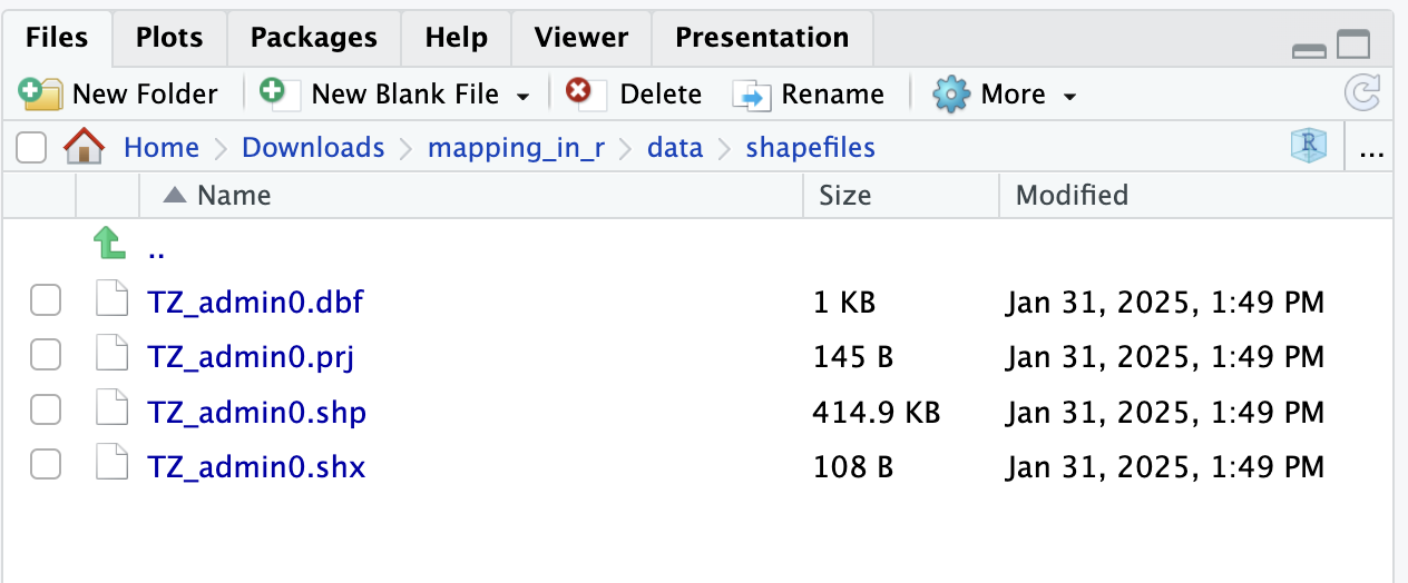
Shapefiles often have many file types associated to it. Each of these files continains valuable information. The most important file is the .shp file which is the main file that stores the feature geometries. .shx is an index file to connect the feature geometry and .dbf is a dBASE file that stores all the attribute information (like a table of information). These three files are required for plotting vector data. Often times you might also get additional useful files such as the .prj which stores the coordination system information.
Importing shapefiles into R
Shapefiles can be called in to R using the function st_read(). Similarly to read_csv() we include a filepath to a shapefile. In this instance we would load the part of the shapefile that ends with .shp
Polygons
tz_admin1 <- st_read("data/shapefiles/TZ_admin1.shp")Reading layer `TZ_admin1' from data source
`C:\Users\jmillar\OneDrive - PATH\Documents\github_new\ammnet-hackathon\posts\mapping-r\data\shapefiles\TZ_admin1.shp'
using driver `ESRI Shapefile'
Simple feature collection with 36 features and 16 fields
Geometry type: MULTIPOLYGON
Dimension: XY
Bounding box: xmin: 29.3414 ymin: -11.7612 xmax: 40.4432 ymax: -0.9844
Geodetic CRS: WGS 84You’ll notice that when you load the shapefile in, there will be a set of information explaining the features of the shapefile. The first sentence shows that you have loaded a ESRI shapefile, it contains 36 features (which are polygons in this case) and 17 columns of information stored as a data tabll. It mentions also there is a spatial extent (called bounding box) and the coordinate reference system (CRS).
You can also get this information when you simply call the sf object
tz_admin1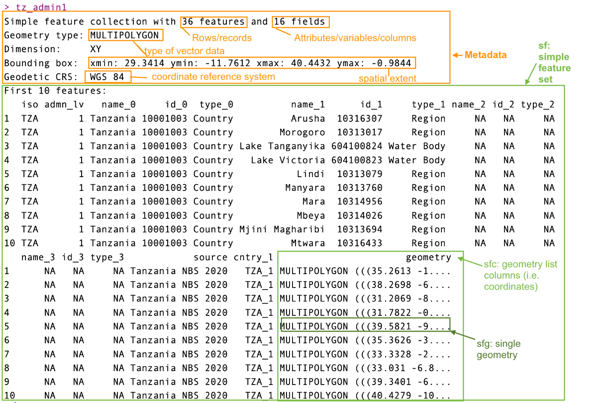
The snapshot above would likely be similar to what you would see in your console. You’ll notice that it would display in your environment as a table, but the difference between this and any other table is that it includes additional information in the metadata indicating its spatial features. In this case it is important to read in and check the metadata for the type of spatial information you have loaded.
Point data
Now that we have in some polygon information, let’s try load a different type of vector data - points. Often times in public health space we would receive data that might represent points on a map (e.g. cases at a health facility, bed nets used in a village). This style of data would include GPS coordinates of longitude and latitude to help us know geographically where they are located.
We are going to pull some prepared MIS data into R. For alternatives I would suggest checking out the malaria prevalence data using the malariaAtlas package in R.
tz_pr <- read_csv("data/pfpr-mis-tanzania-clean.csv")Rows: 436 Columns: 27
── Column specification ────────────────────────────────────────────────────────
Delimiter: ","
chr (9): country, country_id, continent, site_name, rural_urban, method, r...
dbl (15): id, site_id, latitude, longitude, month_start, year_start, month_...
lgl (2): pcr_type, source_id3
date (1): date
ℹ Use `spec()` to retrieve the full column specification for this data.
ℹ Specify the column types or set `show_col_types = FALSE` to quiet this message.# Make the gps data into a point simple feature
tz_pr_points <- st_as_sf(tz_pr, coords = c("longitude", "latitude"), crs = 4326)You’ll notice that when you brought in the data it does not display the spatial information and came in as a table, so then we may want to convert these into spatial information using the st_as_sf() function. The data we’ve pulled is all the public available data from the DHS program for Tanzania, we’ve pre-processed this specifically for prevalence information only. It includes the latitude and longitude information. When converting the table to a simple feature it must have complete information (i.e. no missing coordinates), we would recommend if you get data from elsewhere make sure to check there is no missingness. Note that we set the projection for the spatial object using the crs command; crs 4326 is the standard WGS 84 CRS.
Plotting the shapefiles in ggplot2
Now that we have some shapefiles let’s try make a plot of them both. We can use the geom called geom_sf() with the ggplot funtions to make a plot. This was explored in the previous hackathon on data visualization
tz_region <- ggplot(tz_admin1)+
geom_sf()+
theme_bw()+
labs(title = "Tanzania Regions")We now have a plot of the map of Tanzania and its regions. Like other ggplots we can continue to add points to this map.
ggplot()+
geom_sf(tz_admin1, mapping = aes(geometry = geometry))+
geom_point(tz_pr, mapping = aes(x = longitude, y = latitude, color = pf_pr))+
scale_color_distiller(palette = "Spectral")+
theme_bw()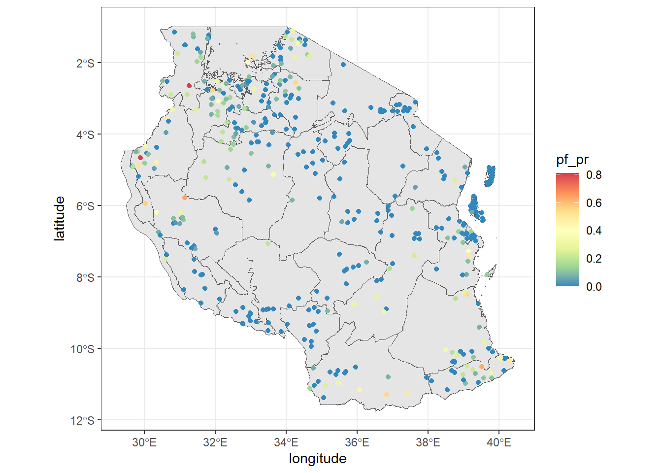
Note that when you move the data into the geom_sf() it must include a mapping= aes() argument. If you don’t have any specific information you want to display and just want the map, you can say you would like it to map to the geometry .
Challenge 1: plot the spatial points
- Try make the same map as above but using the
tz_pr_pointsspatial dataset instead, whatgeomwould you use? - Can you change the shape, transparency and color of the points?
- Can you make the size vary by examined?
Solution
ggplot()+
geom_sf(tz_admin1, mapping = aes(geometry = geometry))+
#notice we added size inside the aes(), shape and alpha control icon and transparency respectively
geom_sf(tz_pr_points, mapping = aes(color = pf_pr, size = examined), shape = 15, alpha = 0.7)+
#we added the scale_size() to control the size of points
scale_size(range = c(0.5, 4))+
#there are many palettes available, try see which one works for you
scale_color_distiller(palette = "RdBu")+
theme_bw()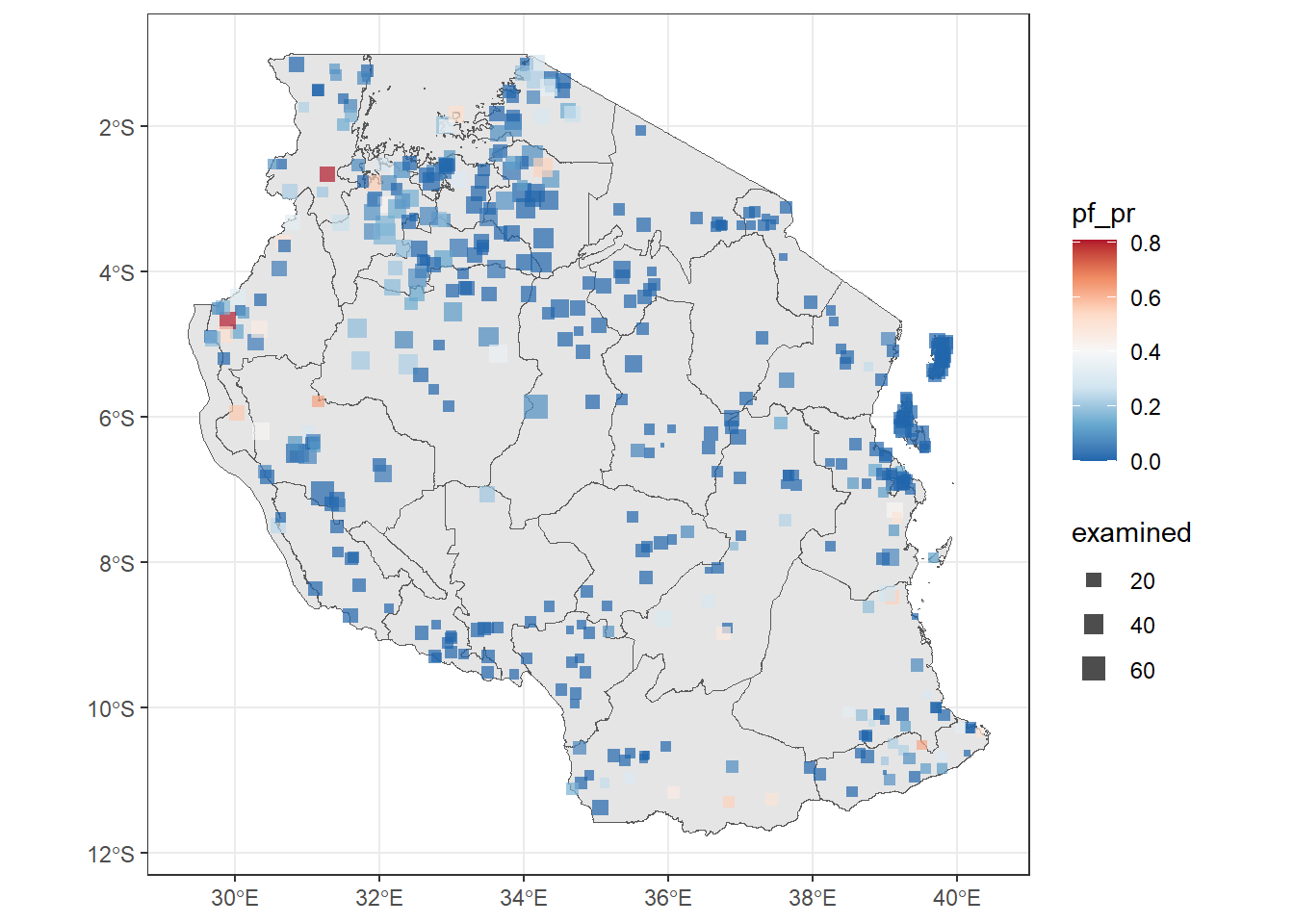
Joining data to shapefiles
We often want to join data to shapefiles to enable the creation of maps and to analyse spatial data. You can use the join functions in tidysverse to join sf data to tables. Just note that the sf data must go first to automatically be recognised as sf. Else you would need to reset it using st_as_sf() .
We’re gonna bring in population data by Region to join to the regional shapefile. However, before we can join the data, the names for the regions don’t match. In order for a correct join the key column must be exactly the same in both datasets. So we must make a key column called name_1 to match the shapefile. We’ll be using the tricks we learnt previous hackathons like the function str_to_sentence() from the stringr package of tidyverse.
tz_pop_adm1 = read_csv("data/tza_admpop_adm1_2020_v2.csv") %>%
#Change the characters from upper to title style
mutate(name_1 = str_to_title(ADM1_EN)) %>%
#Some names completely don't match so manually change them
mutate(name_1 = case_when(name_1 == "Dar Es Salaam" ~ "Dar-es-salaam",
name_1 == "Pemba North" ~ "Kaskazini Pemba",
name_1 == "Pemba South" ~ "Kusini Pemba",
name_1 == "Zanzibar North" ~ "Kaskazini Unguja",
name_1 == "Zanzibar Central/South" ~ "Kusini Unguja",
name_1 == "Zanzibar Urban/West" ~ "Mjini Magharibi",
name_1 == "Coast" ~ "Pwani",
TRUE ~ as.character(name_1) #be sure to include this or it will turn name_1 NA
))
#check if names in the columns match
table(tz_admin1$name_1 %in% tz_pop_adm1$name_1)
FALSE TRUE
5 31
Tip
You’ll notice 5 regions haven’t matched the population table. If you open the shapefile you’ll find the column type_1 and notice that the shapefile includes polygon shapes for water bodies. If you’d like to exlcude these you can run a filter and make a tz_region_only shapefile by running:
tz_region_only <- filter(tz_admin1, type_1 == "Region")
Now we can join the data to the current shapefile. Don’t worry that they currently don’t match! we have a plan ;)
tz_pop_admin1 <- tz_admin1 %>% left_join(tz_pop_adm1, by = "name_1")
ggplot(tz_pop_admin1)+
geom_sf(mapping = aes(fill = T_TL))+
#use na.value to make the lakes appear as lightblue
scale_fill_viridis_c(option = "B", na.value = "lightblue", trans = 'sqrt')+
theme_bw()+
labs(fill = "Total Population")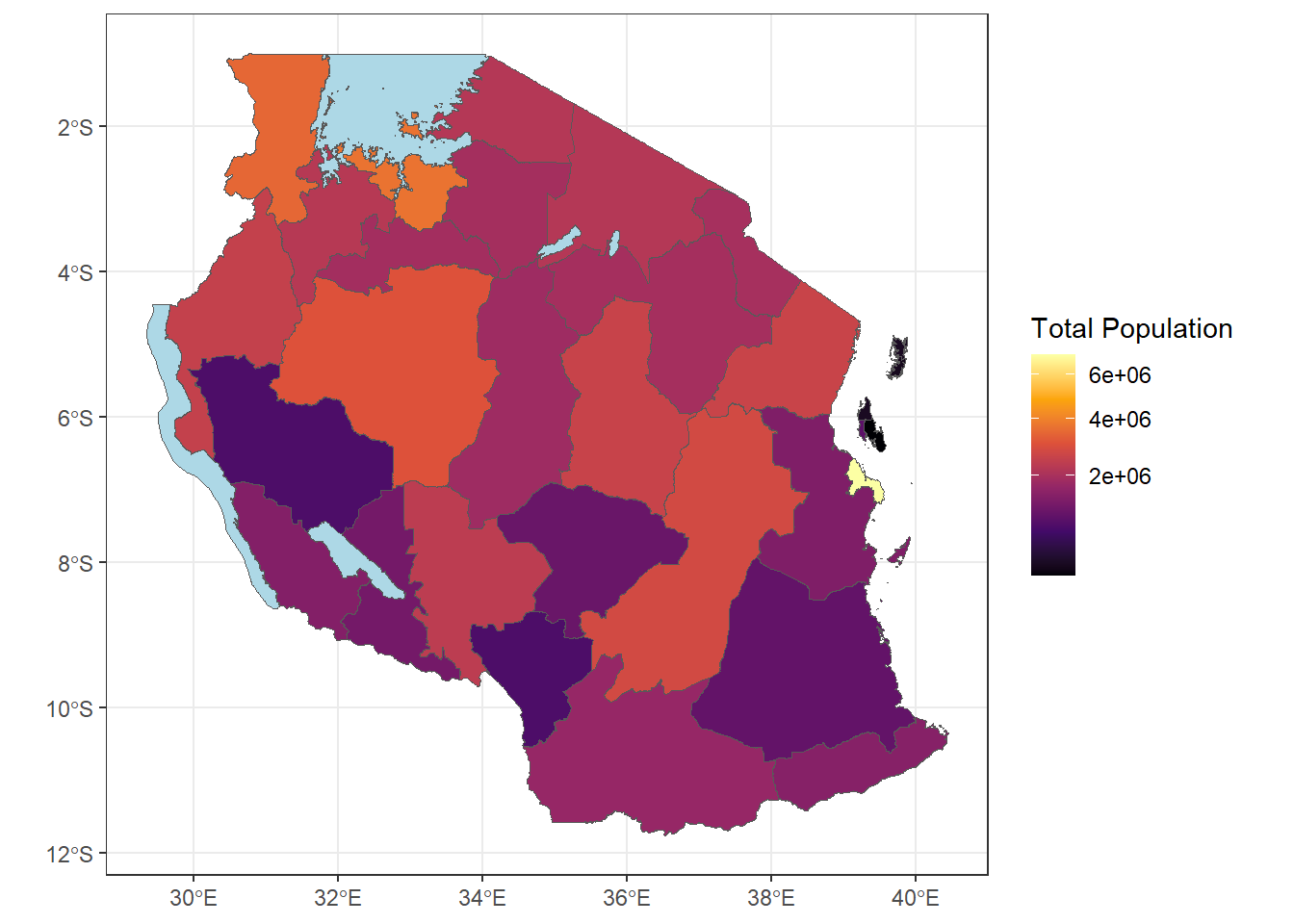
Challenge 2: plot binned information
- Can you make the plot above using binned categories for population?
Solution
ggplot(tz_pop_admin1)+
geom_sf(mapping = aes(fill = T_TL))+
#use na.value to make the lakes appear as lightblue
scale_fill_viridis_b(option = "B", na.value = "lightblue", trans = 'sqrt', breaks = c(0,100000,1000000, 2000000, 3000000, 4000000, 8000000))+
theme_bw()+
labs(fill = "Total Population")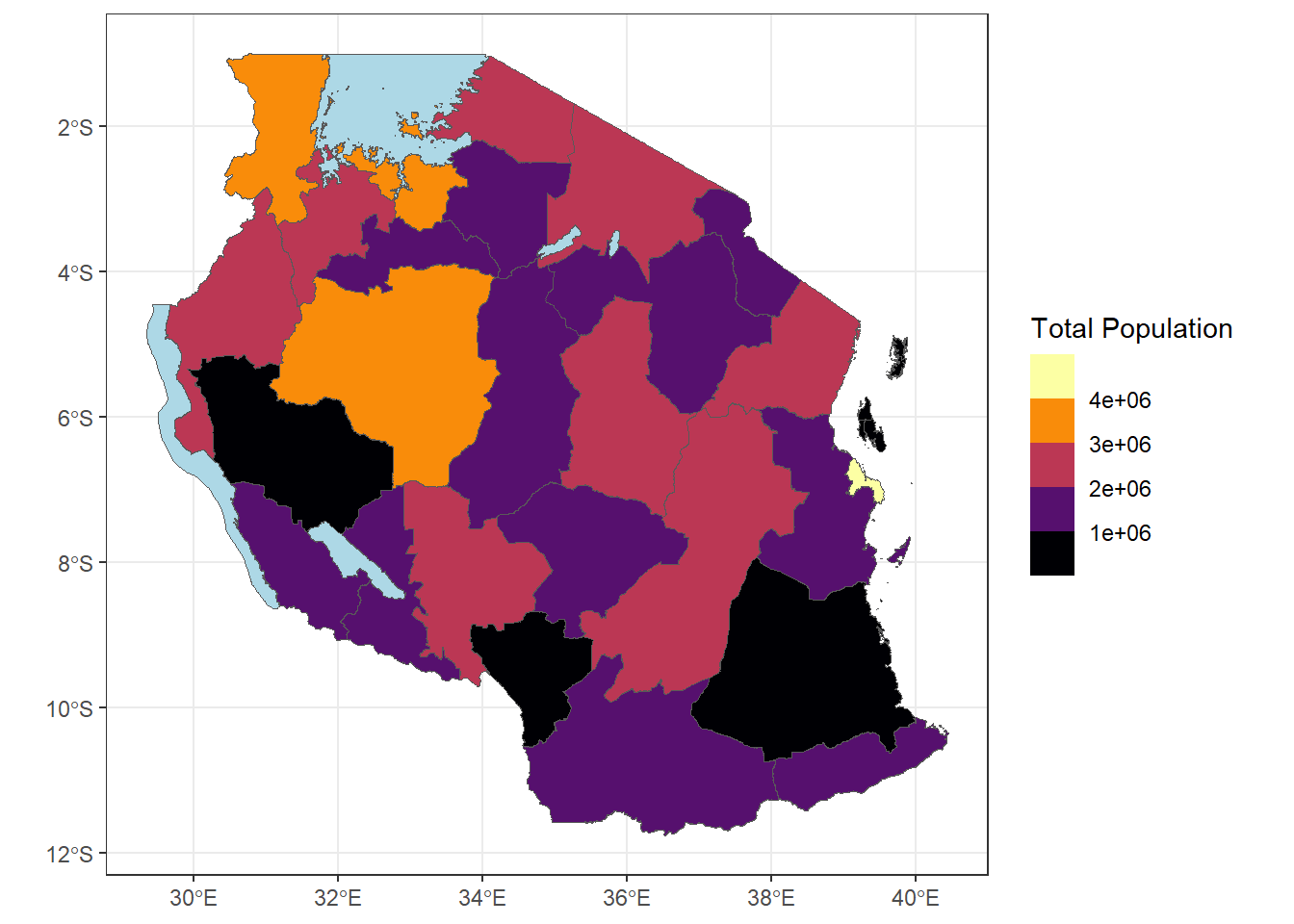
Extracting polygon names for point data
coming back to our prevalence data, often times for decision making we might want data to be summarised to regional forms. Currently the point prevalence doesn’t have any information about which region they belong to. So we can using the st_join . By default this spatial join will look for where the geometries of the spatial data’s intersect using st_interesect . It also by default uses a left join which is why the points come first.
sf_use_s2(FALSE)
tz_pr_point_region <- st_join(tz_pr_points, tz_admin1)from this we can try and calculate the mean prevalence in each region
tz_region_map <- tz_pr_point_region %>%
ungroup() %>% #run this to remove any previous groupings that occured
group_by(name_1) %>%
summarise(mean_pr = mean(pf_pr, na.rm=TRUE)) %>%
st_drop_geometry() %>%
#we put a "." to indicate where the data we've been working with goes for left join
left_join(tz_admin1, .) %>%
ggplot()+
geom_sf(mapping = aes(fill = mean_pr))+
scale_fill_distiller(palette = "Spectral", na.value = "lightblue")+
labs(fill = "Mean PfPR 0-5 years", title = "Tanzania Regions", subtitle = "MIS 2017")+
theme_bw()
tz_region_map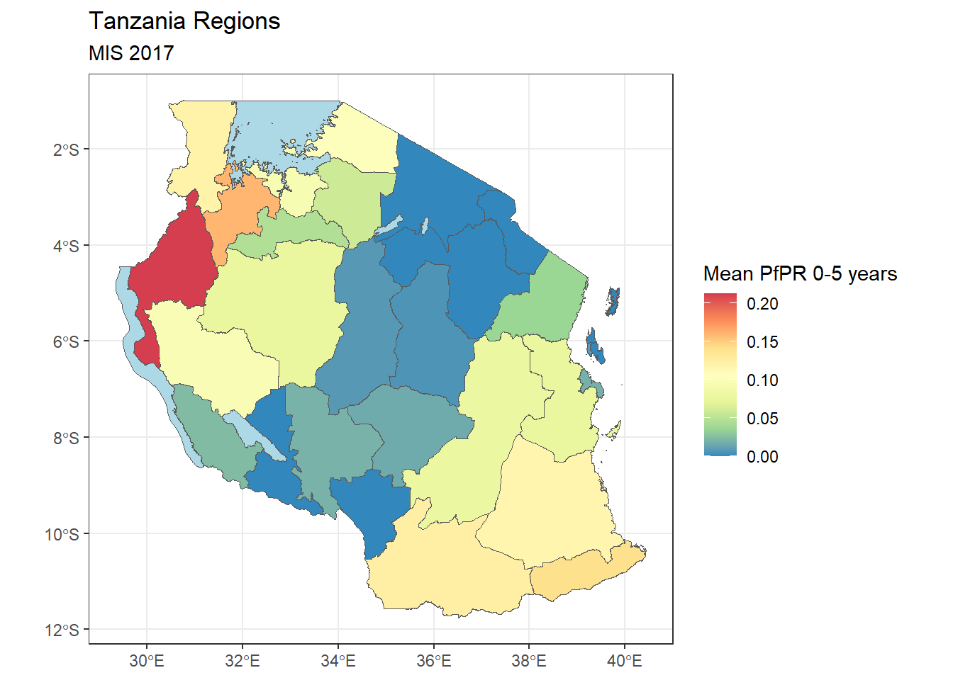
Buffers
Sometimes you might want to create a buffer around the spatial information you have. Let’s try this on the point data. we’ll make a 20km buffer around each spatial point. We can use the st_buffer() to create this.
tz_pf_buffer_20km <- st_buffer(tz_pr_points, dist = 0.2) #20km is approx 0.2 decimal degree close to the equatorWarning in st_buffer.sfc(st_geometry(x), dist, nQuadSegs, endCapStyle =
endCapStyle, : st_buffer does not correctly buffer longitude/latitude datadist is assumed to be in decimal degrees (arc_degrees).tz_region+
geom_sf(tz_pf_buffer_20km, mapping = aes(geometry = geometry))+
geom_point(tz_pr, mapping = aes(x = longitude, y = latitude, color = pf_pr), size = 0.5)+
scale_color_distiller(palette = "Spectral")+
labs(color = "PfPR 0-5 years", subtitle = "MIS 2017")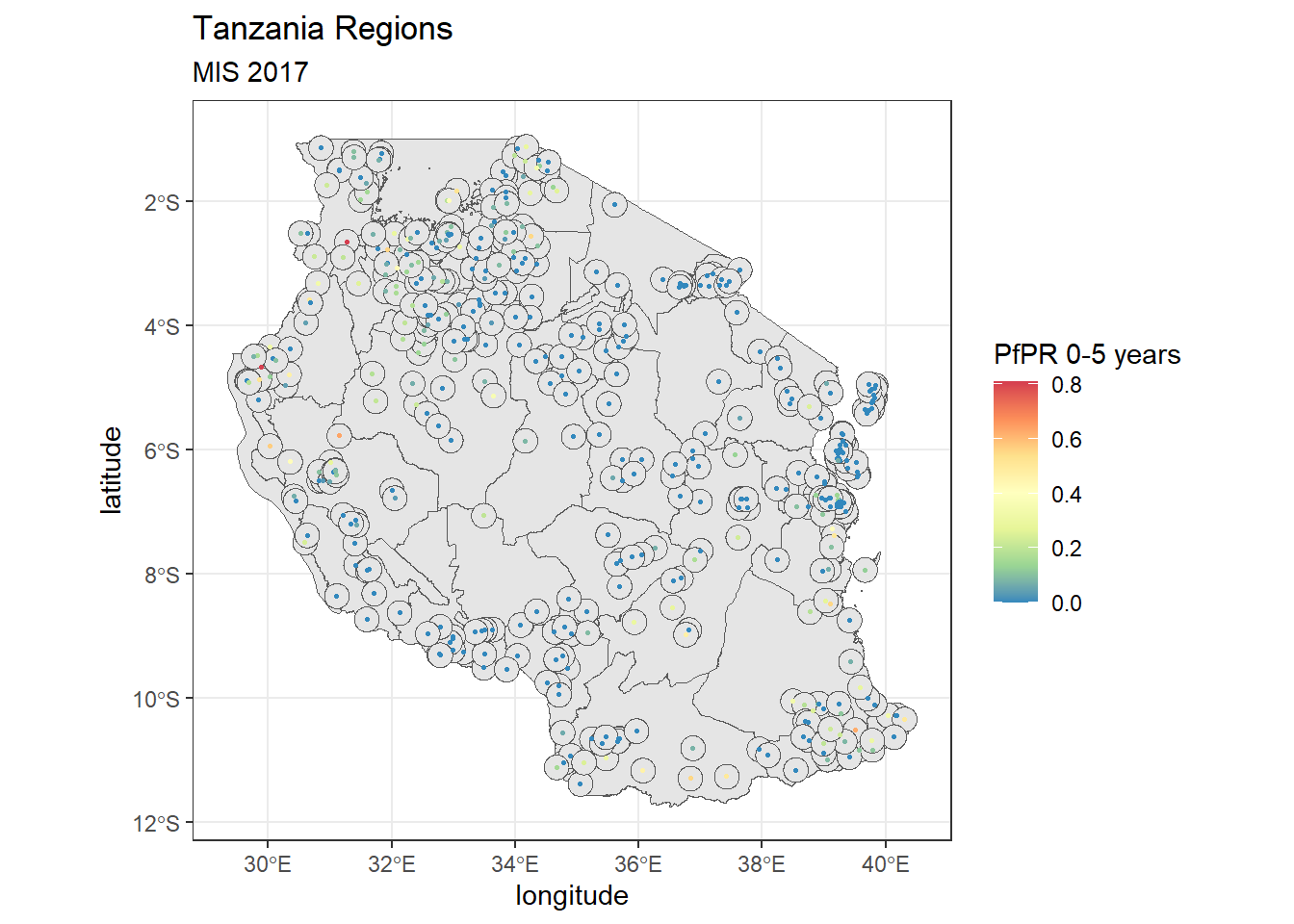
Buffers are especially useful when you combine them with rasters and want to extract a summarised value of pixels for a small area.
Note that you’ll have gotten a warning that buffers don’t work correctly with longitude/latitude data. Remember the coordinate reference systems - these are important! the unit for the CRS we use WGS84 is decimal degrees and assumes an ellipsoidal (round) world still. However, the maps we create are flat. For best results you should think about changing the coordinate reference system to UTM (Universal Transverse Mercator) that assumed a flat plan and uses units of meters.
Shapefile projections
Let’s look at our current CRS. You can view the CRS using the command st_crs()
st_crs(tz_admin1)Coordinate Reference System:
User input: WGS 84
wkt:
GEOGCRS["WGS 84",
DATUM["World Geodetic System 1984",
ELLIPSOID["WGS 84",6378137,298.257223563,
LENGTHUNIT["metre",1]]],
PRIMEM["Greenwich",0,
ANGLEUNIT["degree",0.0174532925199433]],
CS[ellipsoidal,2],
AXIS["latitude",north,
ORDER[1],
ANGLEUNIT["degree",0.0174532925199433]],
AXIS["longitude",east,
ORDER[2],
ANGLEUNIT["degree",0.0174532925199433]],
ID["EPSG",4326]]st_crs(tz_pr_points)Coordinate Reference System:
User input: EPSG:4326
wkt:
GEOGCRS["WGS 84",
ENSEMBLE["World Geodetic System 1984 ensemble",
MEMBER["World Geodetic System 1984 (Transit)"],
MEMBER["World Geodetic System 1984 (G730)"],
MEMBER["World Geodetic System 1984 (G873)"],
MEMBER["World Geodetic System 1984 (G1150)"],
MEMBER["World Geodetic System 1984 (G1674)"],
MEMBER["World Geodetic System 1984 (G1762)"],
MEMBER["World Geodetic System 1984 (G2139)"],
ELLIPSOID["WGS 84",6378137,298.257223563,
LENGTHUNIT["metre",1]],
ENSEMBLEACCURACY[2.0]],
PRIMEM["Greenwich",0,
ANGLEUNIT["degree",0.0174532925199433]],
CS[ellipsoidal,2],
AXIS["geodetic latitude (Lat)",north,
ORDER[1],
ANGLEUNIT["degree",0.0174532925199433]],
AXIS["geodetic longitude (Lon)",east,
ORDER[2],
ANGLEUNIT["degree",0.0174532925199433]],
USAGE[
SCOPE["Horizontal component of 3D system."],
AREA["World."],
BBOX[-90,-180,90,180]],
ID["EPSG",4326]]If these projections say don’t match or aren’t in the correct coordinate system for our analysis we can change the projection using the command st_transform().
# Change the projection to UTM zone 35S
tz_admin1_utm <- st_transform(tz_admin1, 32735)
tz_pr_points_utm <- st_transform(tz_pr_points, 32735)
Where to find the right CRS?
The code needed for the crs is normally called ESPG short for European Petroleum Survey Group that maintains the standard database of codes and can be found on https://epsg.io/
simply type your country and it’ll offer suggested CRS to use
Challenge 3: plot projected shapefiles
- Calculate the buffer at 20km, hint: remember the projection units
- Can you make a plot the projected shapefiles?
- Do you see any difference between the maps? If not, why?
Solution
tz_pf_buffer_20km_utm <- st_buffer(tz_pr_points_utm, dist = 20000) #20km is approx 0.2 decimal degree close to the equator
ggplot(tz_admin1_utm)+
geom_sf()+
geom_sf(tz_pf_buffer_20km_utm, mapping = aes(geometry=geometry))+
geom_sf(tz_pr_points_utm, mapping = aes(color = pf_pr), size = 0.5)+
scale_color_distiller(palette = "Spectral")+
labs(color = "PfPR 0-5 years", subtitle = "MIS 2017")+
theme_bw()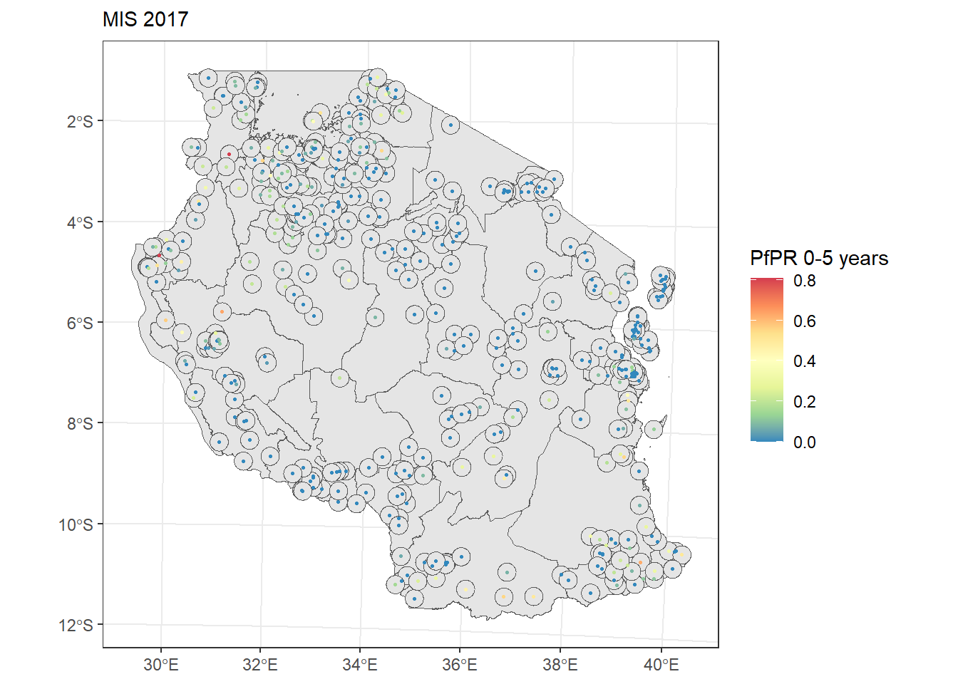
Making publication style maps
for publishing maps typically you’ll find that maps require a bit more information, such as north compass, scale bars and appropriate legends. We can use ggspatial package for that.
publicaton_pr_map <- tz_region_map+
annotation_north_arrow(
location = 'tr', #put top right
height = unit(0.5, "cm"),
width = unit(0.5, "cm")
)+
annotation_scale(
location = 'bl', #bottom left
)+
theme_void()
publicaton_pr_map
We might want to add labels of the regions on as well, we can do this using ggreppel
publicaton_pr_map+
geom_sf_text(mapping = aes(label = name_1), size = 1.5)Warning in st_point_on_surface.sfc(sf::st_zm(x)): st_point_on_surface may not
give correct results for longitude/latitude data
Writing out plots and shapefiles
Once we’ve completed out image we might want to save it. We can use ggsave() to do so. Note that if you don’t specific the plot object it will save the last image you created in the plot window
ggsave(filename = "tanzania_pr_map_2017.png")If you wish to save one of the shapefiles we’ve created say the population information we can use st_write()
st_write(tz_pop_admin1, "data/shapefiles/tz_population_admin1.shp")You will need to save the file as a .shp file, it will create the other metadata information. Note that if you make any changes and want to save over again you will need to add the overwrite = TRUE argument into st_write()
Interactive maps using tmap
So far we’ve explored the use of the sf package with ggplot as well as some additions like ggspatial. Another useful package that can help build interactive maps in tmap. The tmappackage is a powerful tool for creating thematic maps in R. It provides an intuitive and flexible way to visualize spatial data, similar to how ggplot2 works for general data visualization.
Like ggplot, the package tmap also building maps using layers. You start with tm_shape() to define the data, then add layers with various tm_*() functions.
Let’s try recreate our first map of tanzania regions:
tm_shape(tz_admin1) +
tm_polygons()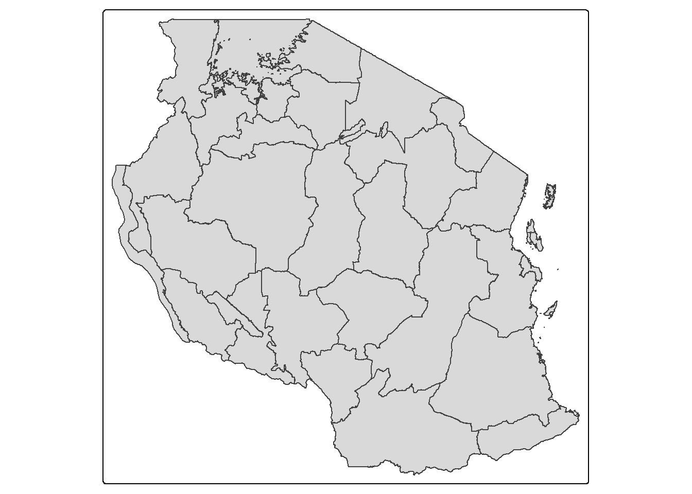
Similarly if we wanted to showcase data in each polygon we could use this for the population data we summarised:
tm_shape(tz_pop_admin1) +
tm_polygons("T_TL", palette = "viridis", title = "Population",
style = 'pretty', n = 4,
colorNA = 'lightblue', textNA = "lakes")── tmap v3 code detected ───────────────────────────────────────────────────────[v3->v4] `tm_polygons()`: instead of `style = "pretty"`, use fill.scale =
`tm_scale_intervals()`.
ℹ Migrate the argument(s) 'style', 'n', 'palette' (rename to 'values'),
'colorNA' (rename to 'value.na'), 'textNA' (rename to 'label.na') to
'tm_scale_intervals(<HERE>)'
For small multiples, specify a 'tm_scale_' for each multiple, and put them in a
list: 'fill'.scale = list(<scale1>, <scale2>, ...)'
[v3->v4] `tm_polygons()`: migrate the argument(s) related to the legend of the
visual variable `fill` namely 'title' to 'fill.legend = tm_legend(<HERE>)'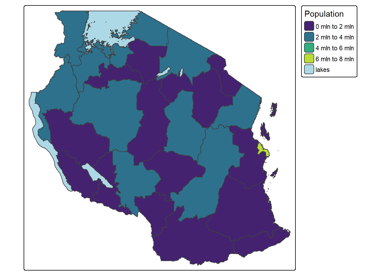
we might want to further customise things like putting the legend outside and add labels to the regions:
tm_shape(tz_pop_admin1) +
tm_polygons("T_TL", palette = "viridis", title = "Population",
style = 'pretty', n = 4,
colorNA = 'lightblue', textNA = "lakes")+
tm_text(text = "name_1", size = 0.5)+
tm_layout(legend.outside = TRUE)── tmap v3 code detected ───────────────────────────────────────────────────────[v3->v4] `tm_polygons()`: instead of `style = "pretty"`, use fill.scale =
`tm_scale_intervals()`.
ℹ Migrate the argument(s) 'style', 'n', 'palette' (rename to 'values'),
'colorNA' (rename to 'value.na'), 'textNA' (rename to 'label.na') to
'tm_scale_intervals(<HERE>)'
For small multiples, specify a 'tm_scale_' for each multiple, and put them in a
list: 'fill'.scale = list(<scale1>, <scale2>, ...)'
[v3->v4] `tm_polygons()`: migrate the argument(s) related to the legend of the
visual variable `fill` namely 'title' to 'fill.legend = tm_legend(<HERE>)'
but the best part of tmap is that it can make your maps interactive. To switch to interactive mode:
tmap_mode("view")ℹ tmap mode set to "view". tm_shape(tz_pop_admin1) +
tm_polygons("T_TL",
id="name_1", #added for the labels in interactive to show region
palette = "viridis", title = "Population",
style = 'pretty', n = 4,
colorNA = 'lightblue', textNA = "lakes")+
#tm_text(text = "name_1", size = 0.5)+
tm_layout(legend.outside = TRUE)
── tmap v3 code detected ───────────────────────────────────────────────────────
[v3->v4] `tm_polygons()`: instead of `style = "pretty"`, use fill.scale =
`tm_scale_intervals()`.
ℹ Migrate the argument(s) 'style', 'n', 'palette' (rename to 'values'),
'colorNA' (rename to 'value.na'), 'textNA' (rename to 'label.na') to
'tm_scale_intervals(<HERE>)'
For small multiples, specify a 'tm_scale_' for each multiple, and put them in a
list: 'fill'.scale = list(<scale1>, <scale2>, ...)'[v3->v4] `tm_polygons()`: migrate the argument(s) related to the legend of the
visual variable `fill` namely 'title' to 'fill.legend = tm_legend(<HERE>)'
Challenge 4: Interactive map of prevalence by region
- Can you make an interactive map of the prevalence by region?
- What is the important information you might need to display?
- Can you try make this at admin2 level?
Solution
tz_pr_point_region %>%
ungroup() %>% #run this to remove any previous groupings that occured
group_by(name_1) %>%
summarise(pf_pos = sum(pf_pos, na.rm=TRUE),
examined = sum(examined, na.rm=TRUE),
mean_pr = pf_pos/examined*100) %>%
st_drop_geometry() %>%
#we put a "." to indicate where the data we've been working with goes for left join
left_join(tz_admin1, .) %>%
tm_shape()+
tm_polygons("mean_pr",
id="name_1", #added for the labels in interactive to show region
palette = "-RdYlGn", #add negative sign to reverse the palette
style = "pretty",
title = "Malaria Prevalence 0-5 years",
colorNA = 'lightblue', textNA = "lakes")#at admin2 (council)
#read data and join points to admin2
tz_admin2 <- st_read("data/shapefiles/TZ_admin2.shp")Reading layer `TZ_admin2' from data source
`C:\Users\jmillar\OneDrive - PATH\Documents\github_new\ammnet-hackathon\posts\mapping-r\data\shapefiles\TZ_admin2.shp'
using driver `ESRI Shapefile'
Simple feature collection with 200 features and 16 fields
Geometry type: MULTIPOLYGON
Dimension: XY
Bounding box: xmin: 29.3414 ymin: -11.7612 xmax: 40.4432 ymax: -0.9844
Geodetic CRS: WGS 84tz_pr_point_council <- st_join(tz_pr_points, tz_admin2)
#summarise data to admin2 for plotting
tz_pr_point_council %>%
ungroup() %>% #run this to remove any previous groupings that occured
group_by(name_2) %>%
summarise(mean_pr = mean(pf_pr, na.rm=TRUE)*100) %>% #calculate prevalence as percent
st_drop_geometry() %>%
#we put a "." to indicate where the data we've been working with goes for left join
left_join(tz_admin2, .) %>%
tm_shape()+
tm_polygons("mean_pr",
id="name_2", #added for the labels in interactive to show region
#you can pick colours to make your own palette
palette = c("green4", "darkseagreen", "yellow2","red3"),
title = "Malaria Prevalence 0-5 years",
n=5, breaks = c(0,1,5,30,100),
labels = c("0 - 1","1- 5","5-30", ">30"),
style = 'fixed',
colorNA = 'lightblue', textNA = "lakes")Additional Resources
We’re hoping this hackathon tutorial has been helpful in getting you started with shapefiles. As you embark on your map making journey i’m sure many of you will have lots of questions about how to do more advanced things. We’ve put together a bunch of more detailed resources that this has both pulled from and the instructors have used in their own work. We hope this will be useful to you too!
If you find any other resources also in different languages we are always looking to share knowledge so please post them on the AMMnet slack for others to get to know more about :)
Here are some favourites:
Data Carprentry Geospatial Lesson: A good starting lesson, mainly focuses on ecology and raster data
Malaria Atlas Training: majority of material has come from this source, it includes some more tutorials on QGIS software too
Sf package tutorials: Includes a cool cheatsheet for getting started
Earth Lab tutorials: overall great resource for everything spatial
The tmap book: a great more detailed book for using tmap, including using tmap for shiny!
Colorbrewer for maps: many folks might want to explore how to manipulate colors on maps, this is a great tool for that!